| Image |
Comment |
| 10/19/2005 11:38:37 AM |
|
| 10/19/2005 09:12:46 AM |
St. John 11:35by LadeeMComment by qbicle: The focus in this picture seems very good to me. As I am not familar with this verse, one thing I find a little confusing is why the word "Where" is in red. For me, it was a little distracting as I couldnt figure out how (or if) it was related to the highlighted words. Also, I personally think you chose a nice angle for this shot. |
 Photographer found comment helpful. Photographer found comment helpful. |
| 10/19/2005 08:49:35 AM |
St. John 11:35by LadeeMComment by LadeeM: My point of focus is the verse, not Jesus. If you don't get my link to personification, fine. I was asking for comments on the photo, NOT more references to the challenge. I GET that no ones gets my reference. |
| 10/19/2005 08:45:06 AM |
St. John 11:35by LadeeMComment by mesmeraj: I don't get it.
Simple as that. And looking at your comments a lot of people didn't.
Jesus was a person. You can't personify something that is already a person. Maybe you point was god making a human son to roam the earth? I don't know. Religious referances are like american flags and grave yards. Not every one shares your beliefs/pride on a global network, and some may have anomosities.
*edit* i think it is really sad that you specfically asked why you got a low score. That you asked for help from people to tell you why this photo did not do well, and you then don't mark thier comments as helpful. Message edited by author 2005-11-14 14:25:05. |
| 10/19/2005 08:31:58 AM |
St. John 11:35by LadeeMComment by UNCLEBRO: I agree that the content is probably one of the main reasons why this got a lot of low votes.
The same way as "cute baby" pictures seem to get an adverse reaction.
It may not seem "fair", but people usually aren't going to vote something very high that has no appeal to them, whether it's a good photo or not.
I didn't vote on this challenge, but I must admit the content of the photo doesn't appeal to me at all (nor do cute babies!!!) |
| Photographer found comment helpful. |
| 10/19/2005 07:34:00 AM |
St. John 11:35by LadeeMComment by cheekymunky: I wont comment on how this fits the challenge. I do think the photo in itself it quite well taken, composition is ok as well. On this monitor at least it looks like there is a bit of purple fringing around the letters but thats not too distracting. I think the reason it didnt do as well as youd hope is because of the subject rather than the way it was taken, thats just an observation of DPC. So dont be too down! |
| Photographer found comment helpful. |
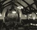
| 10/18/2005 09:02:26 PM |
First United Methodist Churchby LadeeMComment by Jutilda: I love architectural shots. Churches are great. This is nice with it's softness of light. I like the grayed sepia filter as well. Nicely composed with the sideways perspective. |
| Photographer found comment helpful. |
| 10/18/2005 06:24:54 PM |
|
| Photographer found comment helpful. |
| 10/18/2005 10:40:06 AM |
|
| Photographer found comment helpful. |
| 10/18/2005 06:29:05 AM |
|
| Photographer found comment helpful. |
Home -
Challenges -
Community -
League -
Photos -
Cameras -
Lenses -
Learn -
Help -
Terms of Use -
Privacy -
Top ^
DPChallenge, and website content and design, Copyright © 2001-2026 Challenging Technologies, LLC.
All digital photo copyrights belong to the photographers and may not be used without permission.
Current Server Time: 07/16/2026 01:07:34 AM EDT.