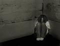
DPChallenge: A Digital Photography Contest You are not logged in. (log in or register
 
Browse Settings
Currently viewing:
Registered UserLadeeM

Show comments:

Per page:

Order:

Comments:


Comments Received by LadeeM
Pages:   ... [51]
Showing 21 - 30 of ~505
Image Comment
Beware
11/03/2005 12:45:14 AM
Beware
by LadeeM

Comment by Neuferland:
Greetings from the Critique Club!

I saw you had posted this in the forums for critique also, let me check that thread before continuing since I'm sure you really don't need to hear the same things over, LOL :)

Well, between the forum posts and the notes here there really isn't much I can add. I like the overall idea, it's very good and would work well with a grainy image but the end effect seemed to have been lost in the post processing. If you take everyone's advice and redo this shot I would love to see it!

Good Luck in Future Challenges!

Deannda
Photographer found comment helpful.
Beware
11/02/2005 09:32:37 PM
Beware
by LadeeM

Comment by livitup:
It achieves its mission, but I've learned that in most cases, brighter and happier images will score much higher than sad, dark images. Indeed, when I look at this photo I get sad, which isn't a fantastic emotion when you're scoring photos.

Don't get me wrong, it's great to make someone feel something, but if you're asking them to rate the photo on a scale of 1-10 then you want them happy when they do it.

That said, this challenge in particular almost demanded a dark and gritty image, and yours delivers. I didn't vote on this challenge, but this probably would have gotten a 5 or 6 from me. Why?

I don't like the "spotlight" effect around the girl. It seems to emote the opposite of the intended emotion, halos and "stepping into the light" make me think of hope, joy, etc.

The photo also lacks contrast. It's overall very flat. Maybe some light pants, or something. There's just so much wall and it is all the same grey which gets rather boring, and is very close to the "color" of her jeans.

It's not a bad picture, by any stretch, and a 5.2 isn't bad, but you probably would have gotten a 6 from me if there was more contrast, and maybe even a 7 if I really felt it.

Hope this helps.
Photographer found comment helpful.
Plethora of Flora
11/02/2005 11:33:52 AM
Plethora of Flora
by LadeeM

Comment by Mr_Pants:
The colours here are wonderful. The images of the flower through the water droplets are really interesting to look at.
Photographer found comment helpful.
Too Fast for the Shutter
11/02/2005 10:33:58 AM
Too Fast for the Shutter
by LadeeM

Comment by Jutilda:
This is simple yet has enough going on to be interesting. Great that the ball is green - to show up as an outstanding color. I like this alot. 8
Photographer found comment helpful.
White Knight
11/01/2005 10:29:07 PM
White Knight
by LadeeM

Comment by madison461:
too harsh in the lighting
Plethora of Flora
11/01/2005 10:10:18 PM
Plethora of Flora
by LadeeM

Comment by rwouthuis:
Wonderful colours and cool abstract relections. Well done.
Photographer found comment helpful.
Plethora of Flora
11/01/2005 07:59:08 PM
Plethora of Flora
by LadeeM

Comment by DrAchoo:
Ah, the ubiquitous drops with subject behind glass. This is a great subject, but it has been done previously so well that you will likely suffer from comparisons to their's. Try a treatment on the glass to bead the water better. The focus isn't very even either. I do like the colors though. 6
Photographer found comment helpful.
Plethora of Flora
11/01/2005 04:00:00 PM
Plethora of Flora
by LadeeM

Comment by Bus352:
This is a cool shot--good colors and tones. For some reason, I wish it was a bit sharper--but great capture!
Photographer found comment helpful.
Plethora of Flora
10/31/2005 07:45:32 PM
Plethora of Flora
by LadeeM

Comment by tpoc:
i feel afraid that this technique really starts to lose its impact when it shows up in lots of challenge themes (regardless of whether or not the photographer executed it well...)

i like the distorted effect to the flowers in the drops. many people shoot them as clear, and i appreciate the abstract effect that occurs within this shot.
Photographer found comment helpful.
Plethora of Flora
10/31/2005 02:20:36 AM
Plethora of Flora
by LadeeM

Comment by FotoMunki:
Less distorted water drops would have been nicer. I like the colors though.
Photographer found comment helpful.
Pages:   ... [51]
Showing 21 - 30 of ~505


Home - Challenges - Community - League - Photos - Cameras - Lenses - Learn - Help - Terms of Use - Privacy - Top ^
DPChallenge, and website content and design, Copyright © 2001-2025 Challenging Technologies, LLC.
All digital photo copyrights belong to the photographers and may not be used without permission.
Current Server Time: 07/31/2025 11:36:42 AM EDT.