DPChallenge: A Digital Photography Contest You are not logged in. (log in or register
 
Browse Settings
Currently viewing:
Registered UserLadeeM

Show comments:

Per page:

Order:

Comments:


Comments Received by LadeeM
Pages:   ... ... [51]
Showing 111 - 120 of ~505
Image Comment
On the Jetty
10/04/2005 08:38:56 AM
On the Jetty
by LadeeM

Comment by Jutilda:
LOVE LOVE LOVE the glow filter. I use it alot and I think it really intensifies the colors of this. It's not appropriate for all images, but I love it on this. The leading line is good as well.
Photographer found comment helpful.
A Corner of Contentment
10/03/2005 02:09:24 PM
A Corner of Contentment
by LadeeM

Comment by TOY:
awwwwww
Photographer found comment helpful.
A Corner of Contentment
10/03/2005 12:41:34 PM
A Corner of Contentment
by LadeeM

Comment by SandyP:
Awww. . .beautiful!!!!!!! The PICTURE of contentment!
Photographer found comment helpful.
A Corner of Contentment
10/03/2005 09:27:42 AM
A Corner of Contentment
by LadeeM

Comment by Jaimeson:
Very cute, though the overexposed spot on the cat's head is distracting.
Photographer found comment helpful.
Wednesday's Moon
09/29/2005 08:57:46 PM
Wednesday's Moon
by LadeeM

Comment by strangeghost:
Greetings from the Critique Club
by strangeghost

COMPOSITION
You missed the intersection of the bottom right third by a bit, but I'm not one to take a ruler out on such things. I go by feel, and by what looks right to MY eye, and I suspect you did as well. The moon as a lovely gibbous gem floating in absolute black space is tough to resist, isn't it? Nice composition. Nice feel for how to crop the image and add interest just by subject placement alone.

TECHNIQUE
Astrophotography is damn hard (I know from experience, check my portfolio). The moon seems like such an easy object to photograph, but it's very difficult to photograph well, even with expensive cameras, telescopes, and means to join the two. Your shot has the appearance of a handheld, with enough sharpening and contrast enhancement to make the major lunar features visible. It lacks the critical sharpness and focus that characterizes a classic, drop-dead gorgeous moon shot, but with your composition, that's not really essential anyway. You probably could've tried a slightly faster shutter as some of the lighter areas are a little blown out.

OVERALL IMPACT
I've found that DPCers generally like a nice moon shot, but yours apparently didn't rise to the standard, garnering only a 4.8 final score. As I glance at your comments now, I see some of the voters did decide to take you to task on the placement of the moon, and that probably affected their vote too. I like your shot and hope you continue to experiment with moon shots. Try at moonrise or set, when the moon is low on the horizon and you can compose interesting shots with trees, buildings, people, and other foreground objects.
Photographer found comment helpful.
Barn - Edit 3 (Reflection w/ Gothic Glow)
09/27/2005 09:12:05 AM
Barn - Edit 3 (Reflection w/ Gothic Glow)
by LadeeM

Comment by CalliopeKel:
Excellent. Love the colors. Wow.
Photographer found comment helpful.
Where Will Destiny Lead?
09/26/2005 03:26:13 PM
Where Will Destiny Lead?
by LadeeM

Comment by Artyste:
Hello, and greetings from the Critique Club. The critique you are about to recieve is tailored for DPC challenges alone, and is not intended to be seen as an artistic critique per se.
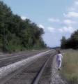
Initial Thoughts

A nice photo, looks oversharpened in areas, despite the blur effect.

Composition / Content

This is rather nice compositionally, although the human subject has been minimalized perhaps a little too much. The scene over-powers here and takes away from the "destination" aspect, at least for me. The tracks lead on to a destination, sure.. but the small figure just seems lost and gratuitous. Artistically, I can see a point that destiny is, traditionally, about being lost and finding our way.. but artistically isn't what I'm worried about when I critique.. and as the image stands, I do believe that voters just weren't grabbed by it because of the lack of a strong connection.

Background

A nice lead off into the distance, but the haze kind of works against you here I think.. lending to a flat color. This might have worked a lot better in a soft sepia tone, or in "hyper-reality".. more of an enhanced color to help the "dreamy" look.

Camera Work / Technical

A nice exposure, but the color is just too flat overall. Your focus is good, but I think maybe using an aperature of f/8 would have helped even more.

Digital Processing

While I generally like the soft-focus effect, and while I can see why you'd use it in a photograph like this, I think it probably turned off too many voters. It's a little strong in areas, and only helps obscure your human subject that much more to my eye. The gradient layer probably contributed to the flat coloring, which is also usually a negative with voters, especially for landscapes or pseudo-landscapes. It works well for portraits or candids.. but landscapes with a desaturated look rarely do well in my experience and observation. There are also areas that look a little oversharpened, but I see that you use the DiMAGE Z2, and I've noticed this "oversharpening" effect from photos of that camera before, and suspect that it's an in-camera thing.

Fits the Challenge

While it fits the challenge on more levels than it appears at first glance, the factors I mentioned above kind of minimize that.. at least on a technical/visual level that is so important to a DPC entry. I think having your human subject more prominent in the scene would have helped this out a little.

My Opinion of the Photo

It's a nice dreamy photo with some wonderful artistic value. I like the statement that I myself can see in it.. the long and hazy road to our destiny.. if it exists. However, on a DPC level, it just falls short in a few areas. It's always a battle.. trying to find a good compromise between what we want to say, and the quest for a better score. Good luck in future challenges.
Photographer found comment helpful.
Wednesday's Moon
09/26/2005 02:44:12 AM
Wednesday's Moon
by LadeeM

Comment by Tim:
good interpretation of the rule of thirds -
Photographer found comment helpful.
Wednesday's Moon
09/25/2005 06:55:26 PM
Wednesday's Moon
by LadeeM

Comment by Tammer:
When I hold my rule of third grids onto the screen, your moon seems just a bit to the right of the intersecting point of interest. Good concept though.
Photographer found comment helpful.
Wednesday's Moon
09/25/2005 04:55:38 PM
Wednesday's Moon
by LadeeM

Comment by Riponlady:
meets challenge but just do not find it very original. clear, sharp well shot
Photographer found comment helpful.
Pages:   ... ... [51]
Showing 111 - 120 of ~505


Home - Challenges - Community - League - Photos - Cameras - Lenses - Learn - Help - Terms of Use - Privacy - Top ^
DPChallenge, and website content and design, Copyright © 2001-2025 Challenging Technologies, LLC.
All digital photo copyrights belong to the photographers and may not be used without permission.
Current Server Time: 08/02/2025 07:05:11 AM EDT.