| Image |
Comment |
| 12/14/2005 10:28:33 PM |
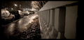
Night Runby bergwaltersComment by owen: Fairly clean photo with good perspective and good choice of B & W. On the down side I think the barrier is a bit overbearing and I don't quite get the title. |
| 12/14/2005 07:23:56 PM |
|
| 12/14/2005 08:36:54 AM |
|
| 12/13/2005 10:46:09 PM |
|
| 12/13/2005 10:27:02 PM |
|
| 12/13/2005 08:40:07 PM |
|
| 12/12/2005 08:35:13 AM |
|
| 05/12/2005 01:52:45 PM |
|
| 05/11/2005 02:06:04 PM |
It's raining, let me in...by bergwaltersComment by ergo: great facial catch on the water drops. Like this image quite a bit, and the planning and thinking is evident. 7. Bumping to 8 to fix my voting curve :) |
| 05/10/2005 01:51:54 PM |
The key to life is to find the key to life of the key, o'key?by bergwaltersComment by HBunch: *Critique Club*
Very nice capture. I like the simplicity of this image. I think it fits the challenge very well.
The focus seems really good on the rocks, but the key appears a bit soft. I'm wondering if it's due to the lighting reflecting off the key.
The key also seems a bit too bright, which is why I'm led to believe that the brightness is affecting the appearance of the focus on the key.
I like the placement of the key within the frame of the photo. very nice use of negative space.
Color is really good.I like how there are little red speckels throughout the photo in the rocks. that adds a bit of interest in the rocks without taking away from the key.
The simple border works well here. I wonder what it would look like against a black border. Would that make the key appear brighter, or maybe tone it down a bit?
Overall a very nice image, that I find highly visually appealing and could only benefit from different lighting on the key in my opinion.
~Heather~ |
Home -
Challenges -
Community -
League -
Photos -
Cameras -
Lenses -
Learn -
Help -
Terms of Use -
Privacy -
Top ^
DPChallenge, and website content and design, Copyright © 2001-2026 Challenging Technologies, LLC.
All digital photo copyrights belong to the photographers and may not be used without permission.
Current Server Time: 07/16/2026 02:31:33 PM EDT.