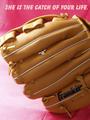
Catch of your lifeby
lissylouComment by HBunch: *Critique Club*
My first impression was "Franklin" brand jewelry?? Which, we all know that Franklin is the brand name of the glove. This would not hold up in a true jewelry ad, since it seems more of an ad for the glove. However, I tried a crop on this just above the word franklin and not only does it eliminate the ball glove ad, it also draws our attention up toward the ring, which, as is, is very small and currently not the main focal point in my opinion.
The lighting appears to be nice. It starts to get just a little bit bright on the glove to the far left, but it's not serious and does not affect the overall photo.
Focus and clarity are really good. I like the detail we get in the glove.
The background is a bit of a distraction. While I personally like the color and the gradient look, there is a crease up near the words, and a seam in the bottom part of the background. That seam would also be eliminated with a crop just above the logo on the glove.
Overall, this is a nice shot to look at, and technically well done, but needs to have a bit more attention on the ring.
~Heather~