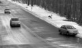
DPChallenge: A Digital Photography Contest You are not logged in. (log in or register
 
Browse Settings
Currently viewing:
Registered UserStormCat

Show comments:

Per page:

Order:

Comments:


Comments Received by StormCat
Pages:   ...
Showing 101 - 110 of ~117
Image Comment
A Sign of Happiness
01/18/2006 09:42:52 AM
A Sign of Happiness
by StormCat

Comment by Jutilda:
LOL That horse is SMILING!!! ha ha ha ha ha
A Sign of Happiness
01/18/2006 08:29:12 AM
A Sign of Happiness
by StormCat

Comment by HighwayFlower:
Love it! 10
A Sign of Happiness
01/18/2006 04:46:41 AM
A Sign of Happiness
by StormCat

Comment by ShutterPug:
gotta love a smiling horse
A Sign of Happiness
01/18/2006 01:56:45 AM
A Sign of Happiness
by StormCat

Comment by Commando303:
The thick white border actually seems to hurt this shot. It's a hillarious picture, though it is a bit weak (technically). Nevertheless, the subject is just great enough for me to be fond of the shot. Nice work.
A Sign of Happiness
01/18/2006 12:17:56 AM
A Sign of Happiness
by StormCat

Comment by linda12201:
great shot-my favorite
Wrong Way
01/10/2006 09:57:55 PM
Wrong Way
by StormCat

Comment by StormCat:
thanks to everyone for the comments. this shot was taken out of a moving car window. the colors were dull so i converted to b/w. it is certainly not my best shot, but the only one i took in that time frame which conveyed the theme of the contest.
Wrong Way
01/10/2006 07:21:11 PM
Wrong Way
by StormCat

Comment by kari1:
::: Critique Club :::

Hi, I am Kari and from the critique club.

I am to critique your photo "wrong way" as requested.

First Impression - the most important one:
Interesting picture, a little stark and a bit small.

Composition:
The composition is ok. I probably would have worked the broken down car into thirds a little more to make it a bit more of the focus of the picture.

Subject:
Great choice of subject matter. Always and so often happens and all you think is sh!!t .. how did they manage that.

Technical (Colour and light):
The picture appears a little blurry but this may be the depth of field. Also a number of the commentors have mentioned that they like the black and white aspect, but how does it look in colour. I would also work on the resizing options as 640 longest side is going to get a bit more attention (especially in thumbnail) than something smaller.

To grow its vote?:
Solid entry... top 50%. As you practice more with your camera and software you will find more ways to entice people into your picture, and ensuring they have to give it more thought.

Summary:
Well done, keep it up.

If you've got any questions about this critique, please feel free to contact me via the PM system.

Cheers

Kari
Wrong Way
01/03/2006 08:27:37 AM
Wrong Way
by StormCat

Comment by eschelar:
Nice composition, good timing. Please resize pictures with the longest side as 640 pixels. It will help a lot.

A tiny bit more contrast and sharpness might help too. I find this to be a little on the soft side.
Wrong Way
01/02/2006 01:51:32 PM
Wrong Way
by StormCat

Comment by AzCKelly:
Wow, Been there, Done this, Live in the Desert now!! Great picture, nice catch. The B&W really makes you focus on the message. Nicely done!
Wrong Way
01/01/2006 11:40:53 PM
Wrong Way
by StormCat

Comment by Tammer:
One of the few entries where it conveys "oops." - point for that. The grayscale looks a bit flat to me. I wonder how this would look with the curves slightly adjusted or more contrast?
Pages:   ...
Showing 101 - 110 of ~117


Home - Challenges - Community - League - Photos - Cameras - Lenses - Learn - Help - Terms of Use - Privacy - Top ^
DPChallenge, and website content and design, Copyright © 2001-2025 Challenging Technologies, LLC.
All digital photo copyrights belong to the photographers and may not be used without permission.
Current Server Time: 08/02/2025 06:58:47 AM EDT.