| Image |
Comment |
| 12/24/2002 01:47:01 AM |
|
| 12/24/2002 12:21:20 AM |
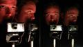
quadruplets. . . (not!)by tomzinhoComment by PTLParsons: I like the composition but it's a little dark for me. Then I don't know what you went through to get this. But I do hope you tell us. The focus is a little too soft for me - can't really distringuish the letters on the camera, but not bad on the faces. A little red on the faces. Still not a bad shot. 6 is respectable. PTL |
| 12/22/2002 10:11:29 AM |
|
| 12/21/2002 07:44:21 PM |
|
| 12/20/2002 02:22:27 PM |
the new new economyby tomzinhoComment by mcrael: Good composition and focus, but I would have preferred more lighting. You might want to try playing with the levels in your photo editing software. |
| 12/20/2002 11:42:49 AM |
|
| 12/19/2002 12:27:26 AM |
|
| 12/18/2002 02:04:09 AM |
the new new economyby tomzinhoComment by Anachronite: uughh another photo I have to put my personal feelings aside on.. lol no one should ever file for unemployment... there's tons of jobs out there... sometimes we just have to do something out of our field until the right job comes along... anyway personal feelings aside, the lighting is good, and the composition and idea is good... just needs more DoF so the focus is sharper |
| 12/16/2002 10:57:44 PM |
the new new economyby tomzinhoComment by PTLParsons: Do you work in the unemployment office or are you unemployed? I'm probably going against everyone else with my critique. I like that the book is not laying flat, but slightly curved. That gives it that used look. It's a little out of focus at the top and the bottom. Maybe if you zoomed back some and didn't get such a tight crop it might help. Good idea just needs a little improvement in the execution. But still a good 7. |
| 12/16/2002 09:57:09 PM |
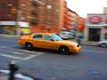
taxi!by tomzinhoComment by zadore: ...from Critique Club...
Hi Tom
FIRST IMPRESSION:
Very nice. :)
COMPOSITION:
A bit centered, but it works. It could be that a bit more space in front of the car would give it 'room to drive into'. I am not sure about the car seeming to be going 'downhill' :|
TECHNICAL:
Perfect. The focus on the car is very nice. Your panning technique worked nicely (even though the car is a tad blurred :) I wonder if bit longer exposure would get a better effect...hard to do if you are doing it hand held. :)
ARTISTIC:
Tom, I must admin that this is not an original shot, IMO. BUT...I think you did a better job than most would. The colour of the cab contrasting with the 'blueish' road works nicely.
OVERALL:
A strong image that could easily appear in an ad for 'Crazy NY taxi drivers....glad to see a nice finish of a photo taken with the same camera as mine :)
Best of luck in the future. Don't hesitate to PM me if you have any questions about this critique.
Cheers...zadore. |
 Photographer found comment helpful. Photographer found comment helpful. |
Home -
Challenges -
Community -
League -
Photos -
Cameras -
Lenses -
Learn -
Help -
Terms of Use -
Privacy -
Top ^
DPChallenge, and website content and design, Copyright © 2001-2026 Challenging Technologies, LLC.
All digital photo copyrights belong to the photographers and may not be used without permission.
Current Server Time: 07/16/2026 06:50:09 AM EDT.