|
|
|
Showing 621 - 630 of ~824 |
| Image |
Comment |
| 02/17/2003 04:45:39 PM | escapeby tomzinhoComment by justine: Great find here, and good eye to see it. Neat shot, well done, good luck to you. |
| 02/17/2003 12:41:17 PM | |
| 02/17/2003 12:30:49 AM | |
| 02/16/2003 12:01:59 AM | cityscape (urban landscape), blue sky and white puffy cloudsby tomzinhoComment by aussie: CC: I love how you have used your lens in this particular shot. I can see that it is a little blurry, but it's just a minor flaw. The clouds are just awesome and the way you have captured this picture overall makes the sky look very dramatic. If you took this in B&W on a really overcast day and did a little manipulation in PS, it would certainly be a more dramatic photo (just a suggestion). I really like how you have captured those buildings with peaks on them it adds to the dramatic feel. Overall a great picture and certainly meets the challenge. Excellent job and well done. |  Photographer found comment helpful. Photographer found comment helpful. |
| 02/09/2003 08:37:34 PM | |
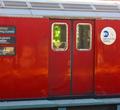
| 02/09/2003 10:33:58 AM | what do we want to see . . . where do we want to go?by tomzinhoComment by magnetic9999: Critique Club
The strange property you refer to is 'perspective'. It causes parallel lines to appear to converge. It's caused by your shooting from an angle to the side. You could correct it with the perspective tool in photoshop, if you have that program.
As I said before, it's a bit fuzzy. The colors are great, though. Is that green stained glass in there?
If you shot this again, you shouldn't cut off the words on the left side. The lucky catch of the person inside the right hand door is a good addition. Helps tell a 'story'. It might be a little too subtle tho. |
| 02/09/2003 09:47:05 AM | weekday to weekend (cover one half and then the other)by tomzinhoComment by lisae: Cool idea... but the lighting is far too stark and the photo has little tonal depth. It needs more contrast, but if you do that, the jacket on the right will be indistinguishable from the background. I think you should have used a white background or maybe grey, and not used front lighting (is it the flash?). | | Photographer found comment helpful. |
| 02/09/2003 12:23:19 AM | |
| 02/06/2003 11:41:51 PM | |
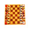
| 02/06/2003 10:45:33 PM | (simplicity) one big square - sixty four small squares - infinite outcomes (complexity)by tomzinhoComment by sylandrix: Greetings from the Critique Club!
COMPOSITION... I find the composition very pleasing, if not for some of the technical errors I will cover in my next paragraph... I think it fits the challenge very strongly, a very pleasing and symmetrical composition. Your description mentions your board is at an angle, but its too slight for me even to notice. I like the bird's eye framing, and the fact that its a unique and colorful chess set you just can't find anywhere. The whiteboard provides an elegant natural frame to the photo and really makes the colors stand out by putting them next to a space with absolutely no color at all. i didn't find there was too much negative space, and this comes from someone who generally does not like empty space in photos :) I think if you took out more white, it would look like an ordinary shot of a chess board.
TECHNIQUE... It was apparent even without your comments that the photo's saturation and exposure were pushed to the extreme. I'm not exactly sure why you chose to do this, though I do understand that it was intentional and not an "error" on your part. Nonetheless, I find the over saturation deteriorates the quality of the image you have, and makes it appear grainier than it should. Not a grain that's typical of a high speed 35mm film, but a grain that's courser, more pixellated and not as appealing as film grain. I tried reversing the saturation back to a normal level, and also removing some of the overexposure, and find the resulting image just as appealing, if not more appealing than this interpretation. I think the shot would actually look more fine and detailed without the extreme image modifications made. If you want to give your photo more punch, before saturating, try a levels adjustment. After i de-saturated the image, I played with that and the final result looked really sharp, and still colorful and full of a wide variety of tones.
OVERALL... good composition and subject matter, but I think your score and image quality suffered from the extreme post-editing performed on your shot. | | Photographer found comment helpful. |
|
Showing 621 - 630 of ~824 |
Home -
Challenges -
Community -
League -
Photos -
Cameras -
Lenses -
Learn -
Help -
Terms of Use -
Privacy -
Top ^
DPChallenge, and website content and design, Copyright © 2001-2026 Challenging Technologies, LLC.
All digital photo copyrights belong to the photographers and may not be used without permission.
Current Server Time: 07/16/2026 05:02:13 AM EDT.
|