| Image |
Comment |
| 04/05/2006 12:42:58 AM |
|
 Photographer found comment helpful. Photographer found comment helpful. |
| 04/03/2006 03:17:29 PM |
|
| Photographer found comment helpful. |
| 04/03/2006 03:15:06 PM |
Phillips Shoes.jpgby ericwooComment by Jutilda: This looks like a postcard! I love the sepia - very nostalgic. The perspective is interesting and not straight on, so the leading line pulls your eye across the image. |
| Photographer found comment helpful. |
| 04/03/2006 03:12:05 PM |
Phillips Shoes.jpgby ericwooComment by Louis: In response to your request for comment: For someone who really appreciates clarity in a subject-focused image, this picture really works. The beautifully sharp lines in both the three-dimensional and two-dimensional letters are extremely pleasing. There is a subtle softness to the forground and background elements that works well in this image, completely avoiding the chance of a busy composition, but instead adding well to the overall effect, and enhancing the setting. The position of the camera in this image works so well in leading one's eye along the path of the image, giving us a chance to linger at all the different objects: a stoplight, a street sign, an old conveyence, and multiple roof ventilation fans whose frequency and unique shape truly add to the exceptional quality of this composition. The sepia-like duotone gives an antique feel to the subject matter. My only criticism is of the large dark patch on the stoplight. The effect may have benefitting from some very subtle dodging there. This is a wonderful picture. |
| Photographer found comment helpful. |
| 04/03/2006 01:32:00 AM |
|
| Photographer found comment helpful. |
| 03/29/2006 05:52:05 PM |
|
| Photographer found comment helpful. |
| 03/27/2006 01:38:07 PM |
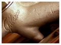
Shakera.jpgby ericwooComment by snapz: I think the sepia and pose look awesome. She'll probably want you to clean up those blemishes on her face. I'm wondering how it would look if her entire hand under her chin were in the frame.
Great series of pics. |
| Photographer found comment helpful. |
| 03/27/2006 11:46:47 AM |
Shakera.jpgby ericwooComment by jenesis: I noticed the skin too, but where do you draw the line on reality and what's appealing to the eye. Also, I suppose it depends on your client. Do they want to look perfect (That would be me, LOL!) or would they be offended if you changed something about their appearance. A little bit of softening might not hurt this one. But overall, I think you did a really good job. I'm not one that sticks to reality when it comes to processing and like to be a little more "Artsy" when it comes to my editing process but that's just me. :-) |
| Photographer found comment helpful. |
| 03/27/2006 09:08:46 AM |
Shakera.jpgby ericwooComment by Jutilda: I love the pose and the composition. I'm wondering if a touch of neat image wouldn't really send it into the WOW realm. Lovely model by the way. |
| Photographer found comment helpful. |
| 03/27/2006 06:28:43 AM |
|
Home -
Challenges -
Community -
League -
Photos -
Cameras -
Lenses -
Learn -
Help -
Terms of Use -
Privacy -
Top ^
DPChallenge, and website content and design, Copyright © 2001-2026 Challenging Technologies, LLC.
All digital photo copyrights belong to the photographers and may not be used without permission.
Current Server Time: 06/10/2026 02:47:22 PM EDT.