| Image |
Comment |
| 05/03/2006 05:36:16 PM |
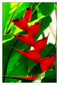
Naturallly Complementedby ericwooComment by tngrndream: hello,
it obviously did well. i think it would have done better ifn your colors were so harsh. the lighting seems to be pretty good overal but making the red colors lacking in any detail. like the red channel is blown out.
but that seems to be the only issue i have.
the composition is good, the subject is nice. the light shining through the plants kind of lighting them up is great. |
 Photographer found comment helpful. Photographer found comment helpful. |
| 05/03/2006 03:13:03 PM |
Naturallly Complementedby ericwooComment by Louis: Awesome "wow" on first view, the colours really doing a lot to enhance the unusually shaped leaves. Very nice image. The white element at top right is unfortunate, and detracts for me. Had that not been there, the effect would have been really superior. Compositionally well done, the red leaves leading our eye up through the centre perfectly. |
| Photographer found comment helpful. |
| 05/03/2006 12:41:05 PM |
Naturallly Complementedby ericwooComment by Kelli: Trading Post...
That's a really cool flower! The colors are great. As I also seem to be told though, that break (background) is distracting. Maybe a different angle could have eliminated that. Congrats on the high placement. Message edited by author 2006-05-03 12:41:47. |
| Photographer found comment helpful. |
| 05/03/2006 12:35:06 PM |
Naturallly Complementedby ericwooComment by nards656: [[Trading Post]]
My first impression is "Great Color!" My second is "Neat Image? Maybe a hair too much, maybe none at all???" A sheet of white paper stuck down on the right side to blank out that background area would have probably given you a full point in the score (my opinion). Excellent composition; the yellows are a BIT oppressive, but not terribly so. |
| Photographer found comment helpful. |
| 05/03/2006 09:41:01 AM |
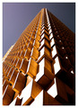
Up, up and awayby ericwooComment by h2: lights are blown, sky is dull, but composition is good. should have a thin black border, as the white areas are fading into the white frame |
| Photographer found comment helpful. |
| 05/03/2006 08:27:10 AM |
|
| Photographer found comment helpful. |
| 05/03/2006 06:49:12 AM |
Naturallly Complementedby ericwooComment by timfythetoo: Cool looking flower. The colors overall are a bit too saturated for my tastes and maybe a bit oversharpened (although I think over saturation sometimes has the same effect). I didnt dislike this shot (I gave a 6) but it also didnt stand out. 46th place is great placing though. |
| Photographer found comment helpful. |
| 05/02/2006 09:42:15 PM |
|
| Photographer found comment helpful. |
| 05/02/2006 07:27:38 PM |
|
| Photographer found comment helpful. |
| 05/02/2006 09:20:24 AM |
|
| Photographer found comment helpful. |
Home -
Challenges -
Community -
League -
Photos -
Cameras -
Lenses -
Learn -
Help -
Terms of Use -
Privacy -
Top ^
DPChallenge, and website content and design, Copyright © 2001-2026 Challenging Technologies, LLC.
All digital photo copyrights belong to the photographers and may not be used without permission.
Current Server Time: 06/11/2026 12:16:27 AM EDT.