| Image |
Comment |
| 05/09/2006 11:08:28 PM |
|
 Photographer found comment helpful. Photographer found comment helpful. |
| 05/09/2006 08:14:12 PM |
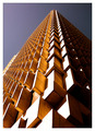
Up, up and awayby ericwooComment by TheRebelPr0: Looks nice, but it has the effect that it looks like its about to fall over on us. As good as it can get w/o a tiltshift lens though. Good job. |
| Photographer found comment helpful. |
| 05/09/2006 11:42:05 AM |
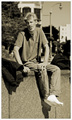
No place to lie his weary head, but $5 richer this day.by ericwooComment by kirsty_mcn: ~trading post~
I do think this should have done better. You've captured a great expression, in an appropriate environment. I guess had he looked more dishevelled it may have suited the theme better.
I like the format and composition - wall cutting image in half, but focus on face and feet at either end. The focus is spot-on, with good dof to give a recogniseable but not distracting background. The monochrome suits it well, but I think it could have done with slightly less saturation in the tone you chose. Mayeb it could have used a touch more contrast - the white point seems a bit 'dirty' rather than white.
Definitely a candid to keep - nice little story to accompany it too.
|
| Photographer found comment helpful. |
| 05/09/2006 06:35:45 AM |
|
| Photographer found comment helpful. |
| 05/08/2006 10:23:54 PM |
No place to lie his weary head, but $5 richer this day.by ericwooComment by Louis: My first impression is that this is more of a candid or portrait, rather than a photojournalism image, and its score may have suffered because of this. On its own though, it's a fine image. Composition is good, and we can see this individual in his setting well. I like the sepia tone, and feel it adds much to the image. It was a nice sunny day, and we can see harsh shadows, that perhaps detract, but only slightly. (The shadows also add a rich set of contrasts that I like.)
In terms of the challenge, perhaps a full-face portrait would have been best, especially if you could have captured the eyes. |
| Photographer found comment helpful. |
| 05/08/2006 10:12:46 PM |
|
| Photographer found comment helpful. |
| 05/08/2006 09:29:19 PM |
No place to lie his weary head, but $5 richer this day.by ericwooComment by DrAchoo: Leroy was going to do the PJ shots, but my quick impression is it is too posed. Even if it isn't, it looks too posed. Perhaps a horizontal crop would have made the subject more a part of his surroundings and let us see more of his world. The B&W conversion is quite nice though. |
| Photographer found comment helpful. |
| 05/08/2006 08:54:41 PM |
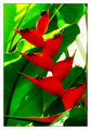
Naturallly Complementedby ericwooComment by elru21: Hello from the critique club,
You have already received many very helpful commments. I considered this for awhile before going on to read what others had to say, so I hope that I can add something to the discussion.
My favorite part about this image is the composition. I love all of the diagonal lines and the shape of the red leaves. I like how the red flower cuts into the frame from one direction and the green leaves form lines in the opposite direction. I like how the longest red flower/leaf comes all the way across the very bottom of the image. It keeps my eye from trailing out the bottom of the frame and sends me looking back upwards. The weakest part of the composition, as you know, is the blank space of the window.
It feels like there is a bit of an upward camera angle, which I like here. Kind of like the greenery is towering above the viewer. Maybe this could have been exagerrated with an even steeper angle? Could you have gotten even closer to the base and really shot up at it?
As you mention in your comments there is some significant loss of detail in both the reds and the greens. THis may be from your exposure or your processing, I am not sure. More detail and contrast in the leaves and flowers would give the image more texture and depth. I like the highly saturated colors, though. I think it works for this image (although it probably contributed a bit to the detiail loss).
For the challenge, the mix of red and green is bang on. I didn't vote in the challenge, but I would have given this a 6. I think it can be very hard at a place like a botanical gardens to separate all of the intense visuals of flowers and plants and find the photograph lurking within. This is a very well seen shot that meets the challenge well, but with some technical limitations.
Please feel free to pm me if you have any questions about any of my commets.
Cheers,
Liza
|
| Photographer found comment helpful. |
| 05/08/2006 08:47:20 PM |
No place to lie his weary head, but $5 richer this day.by ericwooComment by Melethia: Trading Post comment
The thing I noticed first about this picture was his expression; the second thing I noticed was his socks. I'm not sure if this was what people were looking for in this challenge, but it's a good "street candid" of an interesting character. I'm not sure about the golden tones - don't dislike it that way, but I think I may have preferred it in pure B&W. |
| Photographer found comment helpful. |
| 05/08/2006 07:39:14 PM |
No place to lie his weary head, but $5 richer this day.by ericwooComment by DanSig: [[trading post]]
this is a nice portrait, but I think the sephia tone isn't helping the image, the image doesn't look old, so sephia doesn't work well, but B/W with some dodge and burn might make it pop.
and to cut his leg might be a good idea, just in the middle of the leg so you loose the white socks.
just my 2¢ |
| Photographer found comment helpful. |
Home -
Challenges -
Community -
League -
Photos -
Cameras -
Lenses -
Learn -
Help -
Terms of Use -
Privacy -
Top ^
DPChallenge, and website content and design, Copyright © 2001-2026 Challenging Technologies, LLC.
All digital photo copyrights belong to the photographers and may not be used without permission.
Current Server Time: 06/11/2026 01:52:48 AM EDT.