| Image |
Comment |
| 05/17/2006 02:14:10 PM |
|
 Photographer found comment helpful. Photographer found comment helpful. |
| 05/17/2006 01:34:35 AM |
|
| Photographer found comment helpful. |
| 05/16/2006 11:41:24 PM |
Up, up and awayby ericwooComment by tngrndream: hello again,
this one is just great. i guess you are proud of your placing. well done and congrats.
the only thing i see is the sides that are burnt out. i think that kept you from ribboning. this is a great shot and perfectly, beautifully meets the challenge except for the little burn out. with that fixed definite ribbon dude. |
| Photographer found comment helpful. |
| 05/16/2006 10:23:47 AM |
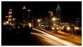
Twinkle, Twinkleby ericwooComment by beefykoala: Oooh, lots to look at but in a good way. Shame there's no real variation in light colour... it all kinda merges together. |
| Photographer found comment helpful. |
| 05/15/2006 12:16:18 PM |
|
| 05/15/2006 01:38:14 AM |
|
| Photographer found comment helpful. |
| 05/14/2006 04:18:03 PM |
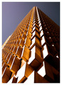
Up, up and awayby ericwooComment by kirsty_mcn: ~trading post~
This is a great photo, ,and i think you've composed it perfectly, with the different angles and the slight off-centredness of the main corner. The colours of the sky and building complement each other well, but the sky seems a little dark, and flat.
Personally I'd prefer a touch less contrast on the building, so that the bottom front is not so blown-out.
Congrats on the placing, and an awesome photo for the challenge, |
| Photographer found comment helpful. |
| 05/13/2006 10:44:09 PM |
Up, up and awayby ericwooComment by graphicfunk: A terrific find for this challenge and captured at the right time of day to create its lovely sweeping rhythmic feel. Congratulations on your top ten finish. |
| Photographer found comment helpful. |
| 05/12/2006 08:30:05 PM |
|
| Photographer found comment helpful. |
| 05/12/2006 05:18:14 PM |
|
| Photographer found comment helpful. |
Home -
Challenges -
Community -
League -
Photos -
Cameras -
Lenses -
Learn -
Help -
Terms of Use -
Privacy -
Top ^
DPChallenge, and website content and design, Copyright © 2001-2026 Challenging Technologies, LLC.
All digital photo copyrights belong to the photographers and may not be used without permission.
Current Server Time: 06/11/2026 03:25:12 AM EDT.