| Image |
Comment |
| 05/18/2006 07:57:28 AM |
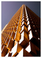
Up, up and awayby ericwooComment by DanSig: [[trading post]]
this is a nice lmage, but I think you should have waited a few hours before shooting, that bright sun burns out to big part of the image wher you could have great details if you'd wait for the sun to go away :)
|
 Photographer found comment helpful. Photographer found comment helpful. |
| 05/18/2006 07:22:22 AM |
Baited and Readyby ericwooComment by raish: This meets the challenge – it’s inanimate and arranged. The elements, however, are much more connected by what they are than by how they look. 6 |
| Photographer found comment helpful. |
| 05/18/2006 05:05:37 AM |
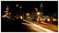
Twinkle, Twinkleby ericwooComment by chalice: I thought this picture was done well. I like the range of tones from white lights to pitch black sky and left foreground. I like the inclusion of the foreground because it balances the skyline and helps add depth to the photo. The leading lines of the road way draw my eye into the heart of the picture. The star-burst street lights are an added plus. |
| Photographer found comment helpful. |
| 05/18/2006 02:41:34 AM |
|
| Photographer found comment helpful. |
| 05/17/2006 11:09:54 PM |
|
| Photographer found comment helpful. |
| 05/17/2006 10:24:54 PM |
|
| Photographer found comment helpful. |
| 05/17/2006 10:01:41 PM |
|
| Photographer found comment helpful. |
| 05/17/2006 07:41:03 PM |
Twinkle, Twinkleby ericwooComment by Melethia: Trading Post comment
I gave this an 8, Eric. I really like night shots like this and will eventually get some of my own. The vantage point you chose is perfect for this kind of shot - nice balance in the buildings on the skyline, both in height and lighting. I like the way the road curves and disappears into the trees. Color and sharpness are good as well.
(Interesting reading comments after I've written mine. I actually like the dark section in the lower left quite a bit.) |
| Photographer found comment helpful. |
| 05/17/2006 05:47:13 PM |
Twinkle, Twinkleby ericwooComment by Kelli: Trading post...
Nice long exposure. I like the colors and the starbursts on the streetlights. The light trails are excellent too. I dislike the large dark spot on the bottom where it looks like it might be trees or bushes. Maybe a slightly different angle to eliminate that would have put you so much higher. |
| Photographer found comment helpful. |
| 05/17/2006 05:27:58 PM |
|
| Photographer found comment helpful. |
Home -
Challenges -
Community -
League -
Photos -
Cameras -
Lenses -
Learn -
Help -
Terms of Use -
Privacy -
Top ^
DPChallenge, and website content and design, Copyright © 2001-2026 Challenging Technologies, LLC.
All digital photo copyrights belong to the photographers and may not be used without permission.
Current Server Time: 06/11/2026 03:25:19 AM EDT.