| Image |
Comment |
| 05/23/2006 10:07:27 AM |
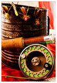
Baited and Readyby ericwooComment by Kivet: at first i thought too red, then the lime green of the reel came in and i think its perfect, great capture, i give it a 10 |
 Photographer found comment helpful. Photographer found comment helpful. |
| 05/21/2006 11:59:58 PM |
|
| Photographer found comment helpful. |
| 05/21/2006 09:33:41 PM |
|
| Photographer found comment helpful. |
| 05/21/2006 07:16:39 PM |
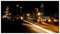
Twinkle, Twinkleby ericwooComment by BakerBug: Hello from the Critique Club!
Well it looks like you have received a lot of good feedback already. I agree with the comments regarding the lower left corner. Maybe a slightly different camera position would have helped with that. I very much like what appears to be turn signals in the middle of the oncoming traffic. I haven't seen that before in a shot like this.
Well done.
-Bill |
| Photographer found comment helpful. |
| 05/21/2006 03:39:44 PM |
Twinkle, Twinkleby ericwooComment by kirsty_mcn: Sorry to get to it so late - I started a comment a few days back but never finished it.
This is a very crisp, strong cityscape. The car trails work well as a leading line, and the small aperture has worked wonders with the lights!
The area of darkness in the bottom left makes the composition a little unbalanced (but I didn't really notice it til the second time I looked at it). Conversely, the brighter area of streetlights on the right hand side works well as a compositional element right on the third. |
| Photographer found comment helpful. |
| 05/20/2006 11:19:31 PM |
|
| Photographer found comment helpful. |
| 05/20/2006 07:12:47 PM |
Twinkle, Twinkleby ericwooComment by timfythetoo: Tradingh post -
Look slike if I hadnt given you that 7 I would have beaten you by a bit. We have a nice little thing going seeing each other on the same page. Very nice shot. Dont really know what I would do to this to make it better. Maybe just a tad higher saturation to make the colors a bit more vibrant - but thats a big maybe. You have a great shot here and it makes me want to go out and see if I could capture something like this. Well done. |
| Photographer found comment helpful. |
| 05/19/2006 11:48:11 PM |
|
| Photographer found comment helpful. |
| 05/19/2006 09:25:53 PM |
|
| Photographer found comment helpful. |
| 05/18/2006 07:59:35 AM |
Twinkle, Twinkleby ericwooComment by DanSig: [[trading post]]
very nice cityscape, good composition, nice colors and overall a good image, the only really distracting thing is that red light on top of one of the buildings.
|
| Photographer found comment helpful. |
Home -
Challenges -
Community -
League -
Photos -
Cameras -
Lenses -
Learn -
Help -
Terms of Use -
Privacy -
Top ^
DPChallenge, and website content and design, Copyright © 2001-2026 Challenging Technologies, LLC.
All digital photo copyrights belong to the photographers and may not be used without permission.
Current Server Time: 06/11/2026 08:30:55 AM EDT.