| Image |
Comment |
| 05/25/2006 12:06:39 AM |
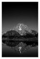
Baited and Readyby ericwooComment by Melethia: Trading Post comment
Top 10! Very nice finish. I rather like the sifter - in fact, that makes the image for me. A nice, tight composition with an interesting color scheme; lighting is excellent for this shot. I'm pleased to see this did well even though it's not flowers or fruit. Good job, and congrats on the excellent finish! |
 Photographer found comment helpful. Photographer found comment helpful. |
| 05/24/2006 09:27:54 PM |
Baited and Readyby ericwooComment by Kelli: Trading post...
Top 10 again! Woohoo! Dude, you're hot. I gave this a 10 in voting. I loved the colors and composition. The lighting is fantastic. Since I gave you a 10 I didn't see anything that could be improved. |
| Photographer found comment helpful. |
| 05/24/2006 08:29:12 AM |
|
| Photographer found comment helpful. |
| 05/24/2006 06:59:55 AM |
|
| Photographer found comment helpful. |
| 05/24/2006 05:41:22 AM |
Baited and Readyby ericwooComment by Tej: *Critique Club*
Congratulations on high score and top 10 placing. The colors and texture is amazing. The subject is different which makes it interesting. The focus is shart but I feel that deeper depth of field might have helped a bit. The extrement left side of the photo seems to be soft-focussed. The is slight over-exposure (or is it glow filter?) visible at highlights (right edge of drum and highlights on metal). These are just minor things I struggled to find out to give my comments. Overall a good composition which stands out for being different (in terms of choice of subject).
Have a nice day!
-Tej |
| Photographer found comment helpful. |
| 05/24/2006 03:01:00 AM |
|
| Photographer found comment helpful. |
| 05/24/2006 12:18:16 AM |
|
| Photographer found comment helpful. |
| 05/23/2006 11:37:35 PM |
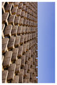
Building Windowsby ericwooComment by justin_hewlett: Very interesting photo, but the composition seems a bit off to me. Personally, I would have included much less sky to emphasize the building even more. As it is right now, it seems to work much better if rotated 90 degrees to the left to form a sort of man-made landscape with foreground and sky. I would like it much better that way, to be honest. |
| Photographer found comment helpful. |
| 05/23/2006 11:33:15 PM |
|
| Photographer found comment helpful. |
| 05/23/2006 08:00:20 PM |
Baited and Readyby ericwooComment by Bosborne: Why is this posted on your website? Isn't that kinda illegal? You posted a comment on the message board about this challenge and linked your website....isn't that kinda against the rules?? |
Home -
Challenges -
Community -
League -
Photos -
Cameras -
Lenses -
Learn -
Help -
Terms of Use -
Privacy -
Top ^
DPChallenge, and website content and design, Copyright © 2001-2026 Challenging Technologies, LLC.
All digital photo copyrights belong to the photographers and may not be used without permission.
Current Server Time: 06/11/2026 03:04:09 PM EDT.