| Image |
Comment |
| 08/03/2006 08:36:31 AM |
|
 Photographer found comment helpful. Photographer found comment helpful. |
| 08/03/2006 08:05:05 AM |
|
| Photographer found comment helpful. |
| 08/03/2006 02:17:28 AM |
|
| Photographer found comment helpful. |
| 08/02/2006 10:18:42 PM |
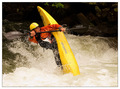
Wheeeeeeeeby ericwooComment by violinist123: Nice shot, loads of action. Like the composition, do not like the border at all. So many shots in this challenge managed to crop out part of the subject, I'm glad you got all of the guy and his paddle in here. Really nothing bad to say, though a slight increase in constrast might give a little more pop to this. Still, really nice work. Good job, 6. |
| Photographer found comment helpful. |
| 08/02/2006 08:47:10 PM |
Wheeeeeeeeby ericwooComment by heathen: oh man, he's in trouble...my favorite kayak shot of the challenge...nicely done. |
| Photographer found comment helpful. |
| 08/02/2006 07:59:41 PM |
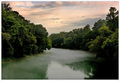
Light Paintingby ericwooComment by Melethia: Trading Post comment
This is lovely! Composition is excellent and I really like the lighting. Background is lit just enough to provide depth without hindering the subject. Quite well done, and I suspect your client was pleased with the result! |
| Photographer found comment helpful. |
| 08/02/2006 04:15:19 PM |
|
| Photographer found comment helpful. |
| 08/02/2006 09:52:15 AM |
|
| Photographer found comment helpful. |
| 08/02/2006 09:11:20 AM |
|
| Photographer found comment helpful. |
| 08/01/2006 06:26:22 AM |
|
| Photographer found comment helpful. |
Home -
Challenges -
Community -
League -
Photos -
Cameras -
Lenses -
Learn -
Help -
Terms of Use -
Privacy -
Top ^
DPChallenge, and website content and design, Copyright © 2001-2026 Challenging Technologies, LLC.
All digital photo copyrights belong to the photographers and may not be used without permission.
Current Server Time: 06/11/2026 03:04:34 PM EDT.