| Image |
Comment |
| 10/01/2007 02:22:43 PM |
|
| 10/01/2007 07:55:13 AM |
Lighting Study v2by Man_Called_HorseComment by timfythetoo: Good general image. I think the light on the left side is a bit harsh on her face and shoulder but could be easily fixed in post process. But the overall lighting is well done and the image appears clean. Not a wow image but one that is well done. |
| 09/25/2007 11:53:51 PM |
|
| 09/25/2007 05:54:43 PM |
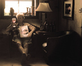
Connoisseurby Man_Called_HorseComment by boyd2000: Quite a contrast between the magazine and wine as opposed to the man's appearance and home with blown out light coming into the window. Nice tone to the picture. |
| 09/25/2007 01:08:00 AM |
|
| 09/24/2007 06:38:35 PM |
|
| 09/23/2007 08:42:19 AM |
|
| 09/21/2007 05:43:48 PM |
|
| 09/21/2007 05:29:46 AM |
Connoisseurby Man_Called_HorseComment by SpringHeeledSimon: Gorgeous shot, colours are perfect. Highlight and pose on the magazine is a bit overstated, something with a more candid feel would have worked better. Nontheless I expect to see this do well, a 9 from me. |
| 09/21/2007 04:56:41 AM |
|
Home -
Challenges -
Community -
League -
Photos -
Cameras -
Lenses -
Learn -
Help -
Terms of Use -
Privacy -
Top ^
DPChallenge, and website content and design, Copyright © 2001-2026 Challenging Technologies, LLC.
All digital photo copyrights belong to the photographers and may not be used without permission.
Current Server Time: 07/16/2026 02:24:58 PM EDT.