| Image |
Comment |
| 04/19/2005 02:43:04 PM |
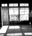
Inside a facadeby Man_Called_HorseComment by Brad: Let's see how I can say this.
I'm not sure the post-processing was done like this on purpose, but the image is far too bright/contrasty in my opinion. The highlights are blown-out (unrecoverable white with no detail in it). Image is a bit tilted to the left also, making it a bit awkward to look at properly.
Shame this was an open challenge as some burning & dodging could bring this one out a lot better. |
 Photographer found comment helpful. Photographer found comment helpful. |
| 04/19/2005 01:29:41 PM |
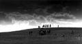
riders on the stormby Man_Called_HorseComment by BobsterLobster: Not sure the grad works well here. Silhouettes are effective, but spoilt by the other figures on the hill. A longer reaching lens would have been more effective here. Why the extra wide crop? |
| 04/19/2005 11:18:27 AM |
|
| 04/19/2005 08:27:49 AM |
Daughter #2by Man_Called_HorseComment by Jutilda: Terrific. I like that you cropped in and just concentrated on her face. Very well done. I'd give it a ten if I could vote on this one. |
| 04/19/2005 02:21:48 AM |
|
| 04/18/2005 08:37:49 PM |
|
| 04/18/2005 05:28:30 PM |
|
| 04/18/2005 04:29:19 PM |
|
| Photographer found comment helpful. |
| 04/18/2005 02:20:34 PM |
|
| 04/18/2005 01:46:52 PM |
|
Home -
Challenges -
Community -
League -
Photos -
Cameras -
Lenses -
Learn -
Help -
Terms of Use -
Privacy -
Top ^
DPChallenge, and website content and design, Copyright © 2001-2026 Challenging Technologies, LLC.
All digital photo copyrights belong to the photographers and may not be used without permission.
Current Server Time: 07/17/2026 02:34:11 AM EDT.