| Image |
Comment |
| 03/24/2003 09:02:45 AM |
|
 Photographer found comment helpful. Photographer found comment helpful. |
| 03/18/2003 06:17:59 AM |
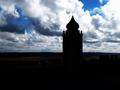
Dark Blue Skyby victor01Comment by victor01: Thanks for your analysis! Very good, much better than photo :)
Originally posted by crabappl3:
~~~~Critique Club Comment~~~~
Dark Blue Sky
Composition (Content)
Your composition seems to be suffering from to much dark area at the bottom. The comments on cropping are correct. I also suffered last week due to cropping and having too much black area at the bottom of my photo. So a crop with just a strip of dark at the bottom and then the tower jutting out from that may have given youe a more pleasing composition. The cloud formations are terrific. Really work well to have the blue area stand out.
Background
Your DOF is good. You have good detail in the clouds on the horizon.
Camera Work (Technical)
Your white balance may be off a tad, as the cloud on the right is really washed out in comparison to the clouds on the left. The shot is level and in good focus.
Digital Processing (Technical)
Sharpening is good (No trace of over sharpening).
Balance between light and dark is fair. (I feel you may have done to much contrast enhancement.)
Compression is good (no jpeg artifacts)
May have wanted to run it through NeatImage to remove some of the noise in the clouds.
My opinion
The clouds and the tower hold the interest for me. I do find the amount of dark area at the bottom distracting. This is a good shot that with just some minor refinements could be a great shot. |
|
| 12/10/2002 09:48:14 AM |
Dark Blue Skyby victor01Comment by crabappl3: ~~~~Critique Club Comment~~~~
Dark Blue Sky
Composition (Content)
Your composition seems to be suffering from to much dark area at the bottom. The comments on cropping are correct. I also suffered last week due to cropping and having too much black area at the bottom of my photo. So a crop with just a strip of dark at the bottom and then the tower jutting out from that may have given youe a more pleasing composition. The cloud formations are terrific. Really work well to have the blue area stand out.
Background
Your DOF is good. You have good detail in the clouds on the horizon.
Camera Work (Technical)
Your white balance may be off a tad, as the cloud on the right is really washed out in comparison to the clouds on the left. The shot is level and in good focus.
Digital Processing (Technical)
Sharpening is good ( No trace of over sharpening).
Balance between light and dark is fair. ( I feel you may have done to much contrast enhancement.)
Compression is good ( no jpeg artifacts)
May have wanted to run it through NeatImage to remove some of the noise in the clouds.
My opinion
The clouds and the tower hold the interest for me. I do find the amount of dark area at the bottom distracting. This is a good shot that with just some minor refinements could be a great shot. Message edited by author 2002-12-10 09:48:54. |
| Photographer found comment helpful. |
| 12/08/2002 10:51:03 AM |
|
| 12/08/2002 09:07:40 AM |
|
| Photographer found comment helpful. |
| 12/07/2002 08:54:35 PM |
Dark Blue Skyby victor01Comment by PTLParsons: Way too much dark area at the bottom of the picture. The sky is beautiful and the sillouette is nice. Nice idea just bad execution. PTL 4 |
| 12/06/2002 06:30:43 AM |
|
| 12/06/2002 03:34:20 AM |
|
| 12/05/2002 09:33:39 PM |
|
| 12/03/2002 09:48:00 PM |
Dark Blue Skyby victor01Comment by Natasha: I love the silhoutte effect here. I think it would be better if you had cropped off the bottom dark area and concentrated on the minoret and the sky. |
| Photographer found comment helpful. |
Home -
Challenges -
Community -
League -
Photos -
Cameras -
Lenses -
Learn -
Help -
Terms of Use -
Privacy -
Top ^
DPChallenge, and website content and design, Copyright © 2001-2026 Challenging Technologies, LLC.
All digital photo copyrights belong to the photographers and may not be used without permission.
Current Server Time: 07/15/2026 03:10:11 PM EDT.