| Image |
Comment |
| 07/17/2006 10:43:15 AM |
|
 Photographer found comment helpful. Photographer found comment helpful. |
| 07/12/2006 12:32:57 PM |
Would you like an Apple little girl?by TheStickComment by levyj413: I like this shot. Yes, the bright spot could be toned down, but the concept is great.
And for the people who complained it's twisted somehow, they should check out this entry from the recent Superstitions and Urban Legends challenge:
 |
| Photographer found comment helpful. |
| 07/11/2006 08:19:18 AM |
|
| 07/08/2006 09:15:01 PM |
Postage Stampby TheStickComment by jpochard: I liked this shot and don't know why it didn't score higher. I like the close up, the idea and the simplicity of the composition. You did a good job on this one. |
| Photographer found comment helpful. |
| 07/08/2006 09:13:55 PM |
Grooving Vanby TheStickComment by jpochard: Like the color! Would have had more impact as a larger file size, and I think that might have hurt your score some because I would have given it higher. Nice composition and idea for the shot. |
| Photographer found comment helpful. |
| 07/08/2006 09:12:28 PM |
|
| Photographer found comment helpful. |
| 07/08/2006 09:10:22 PM |
Wooden Roseby TheStickComment by jpochard: I like the way the design fills the frame. It does show the texture and I'm surprised this didn't finish a bit higher. |
| Photographer found comment helpful. |
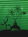
| 07/08/2006 09:09:05 PM |
Green Silhouetteby TheStickComment by jpochard: I like this one but there are some things I would do if it was my shot. I would have centered the plant shape (without the attachments) in front of the blinds and just simplified it by having the focus of the photo on the sillouette of the flower and the green light and shapes of the vase and the blinds. I would have cropped so that you wouldn't get any of the verticle seams/ropes part of the blinds. You should restoot this one because I think it could be a really really cool almost abstract looking photo. |
| Photographer found comment helpful. |
| 07/07/2006 05:43:07 PM |
Joyful Cardby TheStickComment by szalona: i like the colors. the only thing is that the first thing you see is the flower and then the stationery, whereas the subject itself should be stationery. one could always argue though that the decoration on stationery is also the stationery itself. in that case you get a 8 perhaps a boost later. |
| Photographer found comment helpful. |
| 07/07/2006 11:19:58 AM |
Joyful Cardby TheStickComment by Matt414ce: What I like: The light angle is very good.
What might improve it: The background is very rough-looking and I think that detracts from the image. |
| Photographer found comment helpful. |
Home -
Challenges -
Community -
League -
Photos -
Cameras -
Lenses -
Learn -
Help -
Terms of Use -
Privacy -
Top ^
DPChallenge, and website content and design, Copyright © 2001-2026 Challenging Technologies, LLC.
All digital photo copyrights belong to the photographers and may not be used without permission.
Current Server Time: 07/16/2026 05:10:41 AM EDT.