| Image |
Comment |
| 09/03/2002 03:06:00 PM |
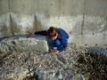
Beach Treasures....by discomushroom11Comment by marcvg: It's a good picture in tems of colours and sharpness. I would prefer it cropped to have the girl sitting in the right bottom left corner (not too much ! you want to see the pebbles). Try it. =6 marcvg |
| 09/02/2002 11:38:00 PM |
|
| 09/02/2002 10:33:00 PM |
|
| 09/02/2002 10:26:00 PM |
Beach Treasures....by discomushroom11Comment by just-married: I looked at this photo for a long time trying to figure out what about it I liked and what was leaving me thirsty. I like the texture and the colors in the stones. I really like her bright blue against a natural background. I like her position. It's the framing that didn't sit well with me. I played with my browser window to get it dropped the way that I would like. I found I liked it best if it were cropped just above where the white salt marks on the wall stop and the part on the right (everything to the right of that last vertical line in the wall) were cropped out. Not sure if that's clear, but it leaves the lower left of the photo in tact, and although I didn't do so intentionally it happens to aline her right arm along the top line of thirds and her body along the 2nd vertical line of thirds. Made it a more visually appealing photo to me and would have been worth a point or two more. Hard to be clear without demonstrating. Happy to try to be more clear if you want. Hope this helps. 6, just-married |
| 09/02/2002 04:01:00 PM |
|
| 09/02/2002 02:34:00 AM |
|
Home -
Challenges -
Community -
League -
Photos -
Cameras -
Lenses -
Learn -
Help -
Terms of Use -
Privacy -
Top ^
DPChallenge, and website content and design, Copyright © 2001-2026 Challenging Technologies, LLC.
All digital photo copyrights belong to the photographers and may not be used without permission.
Current Server Time: 07/15/2026 03:05:18 PM EDT.