| Image |
Comment |
| 01/21/2008 01:50:54 AM |
|
 Photographer found comment helpful. Photographer found comment helpful. |
| 01/21/2008 01:04:53 AM |
|
| Photographer found comment helpful. |
| 01/21/2008 01:00:35 AM |
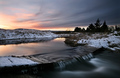
Overflowby BrinComment by Bear_Music: I very much like the understated bleakness of this one. It speaks to a completely realistic, unromantic view of "winter"; nothing Currier-and-Ives about it :-) Congrats on 5th. |
| Photographer found comment helpful. |
| 01/21/2008 12:13:53 AM |
|
| Photographer found comment helpful. |
| 01/20/2008 10:31:14 PM |
|
| Photographer found comment helpful. |
| 01/20/2008 10:12:52 PM |
Overflowby BrinComment by karmat: Very nicely done. I like the subtle pastel colors in this |
| Photographer found comment helpful. |
| 01/20/2008 09:09:03 AM |
|
| Photographer found comment helpful. |
| 01/18/2008 09:11:02 PM |
Overflowby BrinComment by MaryO: That sky is stunning. Lovely, lovely tones here and great composition; I also like that the rivulets going over the little bridge are differentiated instead of being one big, white flow. |
| Photographer found comment helpful. |
| 01/18/2008 06:21:23 PM |
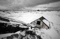
Lostby BrinComment by xodiak: By devoting so much of your image to the space behind the building, you've done a great job of giving a sense of loneliness to your shot. Well done. |
| Photographer found comment helpful. |
| 01/18/2008 03:58:39 PM |
Lostby BrinComment by noraneko: Very cool perspective here. Love the tiny house in the background, too. |
| Photographer found comment helpful. |
Home -
Challenges -
Community -
League -
Photos -
Cameras -
Lenses -
Learn -
Help -
Terms of Use -
Privacy -
Top ^
DPChallenge, and website content and design, Copyright © 2001-2026 Challenging Technologies, LLC.
All digital photo copyrights belong to the photographers and may not be used without permission.
Current Server Time: 06/23/2026 06:50:35 PM EDT.