| Image |
Comment |
| 05/01/2005 07:13:54 PM |
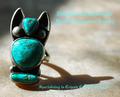
Southwesternby vtruanComment by graphicfunk: Nice rich colors. The type style and colors are nice but that is a common problem in advertising: creating a background to withdtand the type without losing intensity due to uneven background colors and tone. Bumping up on good effort. |
 Photographer found comment helpful. Photographer found comment helpful. |
| 05/01/2005 03:59:25 PM |
Southwesternby vtruanComment by RKT: This is a really nice image, it is the color, placement and maybe the font used I find a little distracting, excellent picture though...nice texture and clarity. |
| Photographer found comment helpful. |
| 05/01/2005 02:57:03 PM |
|
| Photographer found comment helpful. |
| 05/01/2005 12:33:28 PM |
|
| Photographer found comment helpful. |
| 04/30/2005 07:36:27 PM |
|
| Photographer found comment helpful. |
| 04/30/2005 05:29:55 PM |
Southwesternby vtruanComment by GeneralE: The bright lighting shows off the texture of the turquoise, but I'm not that partial to the sharp angle and harshness that introduces. |
| Photographer found comment helpful. |
| 04/30/2005 02:09:51 PM |
Southwesternby vtruanComment by Catherine_B: Lettering is too small to read, and the ring is too blurry. I like the background for the photo though. |
| Photographer found comment helpful. |
| 04/30/2005 11:59:36 AM |
|
| Photographer found comment helpful. |
| 04/30/2005 10:42:50 AM |
|
| Photographer found comment helpful. |
| 04/30/2005 05:11:19 AM |
|
| Photographer found comment helpful. |
Home -
Challenges -
Community -
League -
Photos -
Cameras -
Lenses -
Learn -
Help -
Terms of Use -
Privacy -
Top ^
DPChallenge, and website content and design, Copyright © 2001-2026 Challenging Technologies, LLC.
All digital photo copyrights belong to the photographers and may not be used without permission.
Current Server Time: 07/16/2026 04:59:14 PM EDT.