DPChallenge: A Digital Photography Contest You are not logged in. (log in or register
 
Browse Settings
Currently viewing:
Registered UserMCCullen

Show comments:

Per page:

Order:

Comments:


Comments Received by MCCullen
Pages:   ...
Showing 91 - 100 of ~140
Image Comment
Tracks
05/20/2007 07:11:24 AM
Tracks
by MCCullen

Comment by hexec:
Nice use of the tracks! Tracks are overdone converging lines subject but yours makes a really nice, and different use of them.
Tracks
05/17/2007 01:58:12 PM
Tracks
by MCCullen

Comment by suiteness:
great detail. i love this angle... very unique
Tracks
05/17/2007 08:40:34 AM
Tracks
by MCCullen

Comment by corinne:
maybe it was done on purpose, i do not know, but i would have considered centering this
Tracks
05/16/2007 10:45:27 PM
Tracks
by MCCullen

Comment by cutout:
at last one railroadtrack wat is interesting 9 make some comments
Tracks
05/16/2007 10:01:28 AM
Tracks
by MCCullen

Comment by KarenNfld:
One of the best railroad tracks photo in the challenge, much more creative than the rest.
Tracks
05/16/2007 03:56:59 AM
Tracks
by MCCullen

Comment by horn13:
different perspective on tracks
Waves
05/07/2007 12:13:34 PM
Waves
by MCCullen

Comment by ursula:
Greetings from the Critique Club

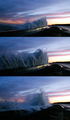
Strong points: A very good idea, telling the story of getting closer to a wave, how it hits the wall, grows, and falls over it. The wave itself is great, as is the sky. I also like the light reflected on the retaining wall, very beautiful.

Possible weaknesses: The presentation doesn't get the story across well enough. The light in the pictures changes. The third picture (bottom) looks softish.

Technicals: You say you took 3 images in burst mode. I'm assuming the "getting closer" is achieved with cropping then. It is hard to make good images in this situation, I think. The light in the sky, even though it is evening (or early morning?), is quite powerful compared to the light on the face of the wave. The images "look" like they have different light. It must be because of the crop.

I wonder if you could have maybe processed each individual image so that the light would look the same, possibly getting a bit more definition on the water itself (curves, shadow/highligh, I might even try tone-mapping here).

Presentation: The 3 images stacked without any divisions or borders between/around them make for a clean, but somewhat bland presentation. The vertical arrangement might be difficult to read - we are used to move eyes more in a horizontal fashion for stories. If would be impossible to put 3 wide images next to each other here, but you could try putting 3 slices next to each other, and see what happens.

Overall: A beautiful series of pictures, and a good score to show for it. I personally think that any of the 3, especially the top 2, might make a pretty good picture all by themselves.

I hope this helps. If I can be of further help, please contact me.

~Ursula
Waves
05/06/2007 04:20:11 PM
Waves
by MCCullen

Comment by TooCool:
Great idea! However I think that the three frames are too similar. If you had differently shaped waves this would be very powerful!
TC
Waves
05/06/2007 01:22:00 PM
Waves
by MCCullen

Comment by LuDeLush:
Intense shot, Well done
Waves
05/04/2007 08:37:27 PM
Waves
by MCCullen

Comment by aerogurl:
i dont understand where this is, or what this is... i assume its the ocean coming in over a breaker wall? the colors are nice..
Pages:   ...
Showing 91 - 100 of ~140


Home - Challenges - Community - League - Photos - Cameras - Lenses - Learn - Help - Terms of Use - Privacy - Top ^
DPChallenge, and website content and design, Copyright © 2001-2025 Challenging Technologies, LLC.
All digital photo copyrights belong to the photographers and may not be used without permission.
Current Server Time: 06/17/2025 09:00:15 PM EDT.