|
|
|
Showing 651 - 660 of ~909 |
| Image |
Comment |
| 01/27/2003 09:10:08 PM | |
| 01/27/2003 12:49:42 PM | Church Doorsby inspzilComment by Jacko: I love the the beautifull shapes here. However, the treatment applied (nagative image) makes it look a bit dirty. Good luck. |  Photographer found comment helpful. Photographer found comment helpful. |
| 01/27/2003 03:12:34 AM | |
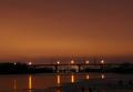
| 01/19/2003 06:27:13 PM | Smoke on the Waterby inspzilComment by karmat: CRITIQUE CLUB CRITIQUE
by karmat
COMPOSITION
You have chosen a good subject, I think, though if the smoke could have a more prominent view in the picture, I think the viewer's would have responded more positively towards it. Maybe if you had chosen a song about a bridge or something . . .. I like that the bridge is in the lower third of the picture. It gives enough foreground to have an "entry" point, and doesn't cut the picture in half. If I were to change anything, I think I might have made the picture more narrower by cropping some of the sky out, because though I like the warm orange color, there is nothing there to add interest or add to the context of the picture. I also like the angle you have shot this with. The river's edge at the bottom right forms a nice contrast with teh horizontal bridge.
TECHNIQUE
This is exposed beautifully as the bridge adn other things in the mid to background are silhouetted, but you can still see some detail at the front. The lights have a nice flare, without being blownout, but you were close, I think. I also like the warmth of the orange, as it lends itself to the "smoky" feeling. I think blue would have been much too cool feeling. The focus is clear and crisp, and I do not notice any "noise" in the sky.
OVERALL EFFECT
I found this picture rather pleasant, though I, like some of the other viewers, would have liked to have seen the smoke play a more prominent role in the picture. It is very warm feeling, as mentioned above, and though I would consider the sky negative space, I do not think it helps to draw attention to the subject. The silhouetted bridge does that. But that is jsut my opinion. Again, I enjoyed this work, as I have many of your others. | | Photographer found comment helpful. |
| 01/15/2003 01:54:30 PM | Rollin' Awayby inspzilComment by HBunch: Well, I thought I'd put my 2 cents in since I saw this in the least commented section. I can't stand to see a neglected photo. I see you got absolutely NO help on this. Here is what I see...
I see that there used to be 4 balls in the shot. The 3 sitting there, and the one rolling away. The reflection is nice. The shot seems grainy, but it COULD just be the texture of the balls. I like the effect of the ball rolling away and the angle and framing/cropping are good. I like how the balls are lined up at a slight diagonal, and not straight across the photo. Lighting is good for this shot, as there really is no need for anything other than the balls. Background is perfect. the white balls stand out very nicely on the black background. It's simply, but it's still a good shot. Can't figure why this didn't get any comments.
~Heather~ | | Photographer found comment helpful. |
| 01/12/2003 02:55:14 AM | Smoke on the Waterby inspzilComment by ChrisW123: Bammp, Bammp, Baaaaa, Bammp, Bammp, Baaaa, Baaaa.... Bammp, Bammp, Baaaaa, Bammp, Baaaa. :) |
| 01/10/2003 03:20:47 PM | |
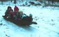
| 01/09/2003 11:24:39 PM | White Knuckle Expressby inspzilComment by karmat: CRITIQUE CLUB CRITIQUE
by karmat
COMPOSITION
I think the composition of this picture is probably its strongest point. The placement of the sled on the left gives the viewer the feeling that it has somewhere to go, and the choice of subjects is priceless. There is nothing compositionally I would change about this picture!
TECHNIQUE
At first glance the picture looks out of focus. Upon closer examination, I see that the sled and kids are very much in focus, it is just the ground around them and the background that is blurry. I think this would be more effective if it had been possible to use a faster shutter speed to have everything focused (effective as far as dpc voters) but a slower shutter speed, if possible, to show tracking would have been cool. Also, there is some detail lost in the bright clothes of the kids. It looks kinda like my pictures when I underexpose them and then try to adjust the brightness/contrast in PaintShop. I have found that adding a touch of saturation adds some depth back to it. OR, instead of adjusting brightness, try adjusting white balance if possible. That will lighten them up sometimes as well. The blue snow gives it a early morning or just before dusk feeling, but being a touch blown out indicates there was probably a fair amount of light. I am no good at photographing snow, but I would suggest the thread somewhere in the forums that discussed it. Apparently, it is a bit tricky to pull off well.
OVERALL EFFECT
At first, the picture did not strike me as anything special, but as I looked closer, I could truly enjoy it because of the wonderful expressions on the face of the youngsters. I think this picture, despite some "problems" mentioned above, would be a wonderful addition to any family's collection, and can be enjoyed for years to come. They are really cute kids, by the way!
| | Photographer found comment helpful. |
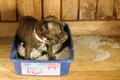
| 01/09/2003 04:54:41 PM | Puppy Litterby inspzilComment by jimmyn4: I think this photo is hilarious. If only you had a tighter crop and a little sharper focus. That pup looks like a trouble maker. | | Photographer found comment helpful. |
| 01/08/2003 09:05:10 PM | |
|
Showing 651 - 660 of ~909 |
Home -
Challenges -
Community -
League -
Photos -
Cameras -
Lenses -
Learn -
Help -
Terms of Use -
Privacy -
Top ^
DPChallenge, and website content and design, Copyright © 2001-2026 Challenging Technologies, LLC.
All digital photo copyrights belong to the photographers and may not be used without permission.
Current Server Time: 06/12/2026 04:48:38 PM EDT.
|