| Image |
Comment |
| 04/20/2005 09:48:47 PM |
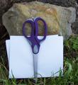
Rock,Paper,Scissorsby booneComment by Gatorguy: No offense, but this composition isn't very compelling. I think the winner of a challenge like this will be one who can show the objects in an interesting and unusual way. I think with a little more thought you could have come up with a way to photograph these objects more dynamically. 5 for being on topic, well exposed and in focus. |
| 04/20/2005 08:04:18 PM |
|
| 04/20/2005 08:18:21 AM |
Rock,Paper,Scissorsby booneComment by Falc: Well yes you have all three elements in the image, but thers nothing else to commend it, no artistry, no use of lighting, just plain flat and dare I say it boring !! |
| 04/20/2005 06:55:15 AM |
|
| 04/19/2005 11:08:18 PM |
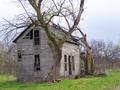
One more payment and it's mineby booneComment by andri: Nice. what I would have loved to see here would have been a shot from further away where the whole tree would have been included. I'd also be curious to see a version where you would stand either a bit more to the left and would have shot the front face of the house straight on more to the right and shot the side straight on. |
| 04/18/2005 11:25:17 PM |
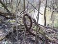
cursive eby booneComment by HBunch: *Critique Club*
I think that the 'cursive e' is clear in the photo, but there are definately a lot of distracting surrounding elements. The photo is very cluttered with other trees, branches, sticks, leaves...etc.
The entire photo is all a very similar color. Muddy brown. That lacks visual appeal to me.
I am not sure how you could have captured this shot without the other elements or with any variation in colors, so I don't think that this shot could be improved upon. I think that the best decision here would be to have chosen a different subject.
Focus seems a tad soft, I think I would like to have seen some detail in the bark. A crisper focus with a little lighting ON the subject could have brought out some more detail.
Overall I like the cursive e, it is definately original, but the photo of the cursive e just doesn't draw me in.
~Heather~
|
| 04/18/2005 03:57:19 PM |
|
| 04/17/2005 09:56:26 PM |
|
| 04/16/2005 10:26:49 PM |
|
| 04/15/2005 10:29:54 PM |
One more payment and it's mineby booneComment by ReallyColorBlind: Very nice photo. I like the color and the composition. I love the back tree. The only thing I don't like is the front tree location. The corner of the building is right in the middle of the tree. |
Home -
Challenges -
Community -
League -
Photos -
Cameras -
Lenses -
Learn -
Help -
Terms of Use -
Privacy -
Top ^
DPChallenge, and website content and design, Copyright © 2001-2026 Challenging Technologies, LLC.
All digital photo copyrights belong to the photographers and may not be used without permission.
Current Server Time: 07/15/2026 12:30:34 PM EDT.