| Image |
Comment |
| 11/14/2005 11:05:38 PM |
|
 Photographer found comment helpful. Photographer found comment helpful. |
| 11/14/2005 08:27:25 PM |
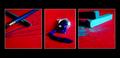
The Artistby annahComment by UpUpCanadian: I really like this. the blue/red contrast is very bold and eye-catching. I would love to see this in a larger size. |
| Photographer found comment helpful. |
| 11/14/2005 07:36:54 PM |
|
| Photographer found comment helpful. |
| 11/14/2005 06:52:34 PM |
The Artistby annahComment by coolhar: the colors look just a bit over-saturated to my eye, otherwise a nice triptych |
| Photographer found comment helpful. |
| 11/14/2005 05:16:07 PM |
The Artistby annahComment by Falc: Gotta get a ribbon with this - it has theme, colour and common structure. Brilliant |
| Photographer found comment helpful. |
| 11/14/2005 04:29:24 PM |
The Artistby annahComment by macrothing: 5 - Good concept, nice bold colors. Criticism; maybe a little too saturated, or it could be that the black frame enhances the colors more so perhaps a different color choice of framing, not sure. Not sure on the thinner middle frame, maybe more 'fore space' in all and more vertical, who knows. |
| Photographer found comment helpful. |
| 11/14/2005 11:52:58 AM |
|
| Photographer found comment helpful. |
| 11/14/2005 10:48:20 AM |
|
| Photographer found comment helpful. |
| 11/14/2005 10:15:42 AM |
|
| Photographer found comment helpful. |
| 11/14/2005 09:00:46 AM |
The Artistby annahComment by susanna: Nice colours, but i think it could have had a bit more light on the left shot.... |
| Photographer found comment helpful. |
Home -
Challenges -
Community -
League -
Photos -
Cameras -
Lenses -
Learn -
Help -
Terms of Use -
Privacy -
Top ^
DPChallenge, and website content and design, Copyright © 2001-2026 Challenging Technologies, LLC.
All digital photo copyrights belong to the photographers and may not be used without permission.
Current Server Time: 07/23/2026 05:48:09 AM EDT.