| Image |
Comment |
| 05/25/2007 11:00:43 PM |
|
| 05/24/2007 04:30:02 PM |
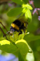
Honeybee 848by marvinComment by elinias: Try to get the focus on the subject, and bees are always more fun from down under than straight above :) |
| 05/21/2007 08:03:07 PM |
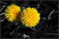
Togetherby marvinComment by saracat: Beautiful treatment of an all-too-common pest, um, weed, um, that is, ... flower. :) Lovely texture to the petals and very realistic color. This would have been all-too-easy to oversaturate. Good job. |
 Photographer found comment helpful. Photographer found comment helpful. |
| 05/21/2007 05:28:26 PM |
|
| Photographer found comment helpful. |
| 05/08/2007 09:41:37 PM |
Head for the mountainsby marvinComment by sfalice: Greetings from the Critique Club
I'm always pleased to get an image from Iceland to critique. I visited your beautiful country for a few weeks a long time ago, and fell in love with it. You have so many kinds of natural beauty. I'll also add that I visited Þingvellir. One of the oldest continuous parlimentary gatherings in the world. Wow.
Okay, to work. Your colors are great, and you show off those snow covered mountains beautifully. They attract the eye immediately and it's tough to let go to visit the rest of your image. But, visit it we must. I find the Direction Pole a bit distracting. I didn't know what it was until I read your notes. It doesn't stand out from the landscape around it, except for that white top. That top is pretty close to the mountains and tends to compete with them.
You have some beautifully detailed information in the mountains and sky, but your foreground could use some darks and lights to bring out the beauty that also exists there. (and I'd lose the Pole.)
All of this is my opinion of course, and just one person's viewpoint. You live in a spectacular place, keep those spectacular images coming.
|
| Photographer found comment helpful. |
| 05/07/2007 12:42:39 PM |
|
| Photographer found comment helpful. |
| 05/07/2007 08:20:41 AM |
Footballby marvinComment by timfythetoo: Greetings from the Critique Club -
First off - you easily met the challenge. I kind of like the odd framing of them, how they arent all the same or rectangular for that matter. Good way to maximaze your spacing. I found it hard to try and get a proper lineup of my images. Your choice to overlap is a good solution to that issue.
The focus being on the ball is good. The main model between your three images and the distinct color of it stands out well.
Some of the distractions in the image for me are these - the blur is a bit too much. I realize that you are shooting action shots here, but having a sharp focus onthe ball in each image could have made them more powerful. The blues also seem a bit oversaturated. And I think that the lighting on the right hand image needed to be bumped up a bit to be closer to the other two.
This isnt a horrible picture but at the same time it doesnt have the punch that would allow it a higher score. Not alot of high votes but really not alot of the lower votes either. Hope some of this helps.
Tim
|
| Photographer found comment helpful. |
| 05/06/2007 03:53:13 AM |
Footballby marvinComment by levyj413: The framing seems accidental and distracts me; I'd prefer to see it as one solid vertical line. But I like the different placement of the ball in each shot. |
| Photographer found comment helpful. |
| 05/05/2007 08:42:59 AM |
Double Bubble Troubleby marvinComment by atupdate: Hello from the Critique Club:
I didn’t vote in the Bubble Challenge so this is the first time I’ve looked at your image. My first impressions are that the big bubble is so overpowering due to being out of focus that the visual effect of the light reflecting off the small bubble gets lost. What I would suggest is that you crop the image almost in half to remove the left half of the big bubble (Which is primarily negative space) including the bright spot at the top of the bubble. This would help feature the small bubble more and the big bubble would provide a dramatic line through the image from the bottom left corner to the upper right corner. I think the colors and saturation are well done in this image and you might have made to 6 with a different crop.
Feel free to PM me if you have any questions regarding this critique.
Tim
|
| Photographer found comment helpful. |
| 05/05/2007 05:05:32 AM |
Footballby marvinComment by Bud: Fun images and creative, the colors and action speak volumes. |
| Photographer found comment helpful. |
Home -
Challenges -
Community -
League -
Photos -
Cameras -
Lenses -
Learn -
Help -
Terms of Use -
Privacy -
Top ^
DPChallenge, and website content and design, Copyright © 2001-2026 Challenging Technologies, LLC.
All digital photo copyrights belong to the photographers and may not be used without permission.
Current Server Time: 07/22/2026 08:21:14 PM EDT.