| Image |
Comment |
| 05/11/2005 10:19:02 PM |
At the balcony of heavenby marvinComment by metoecus: I feel like the person, building, and balcony in the bottom right corner were included as an excuse for the photoshopped clouds which dominate the rest of the image. The strong line at the top of the building enhances the appearance that these are two separate compositions, both of which have a clear, but only mildly interesting focal point. I think that the composition would be improved if there was a greater attempt to tie the two segments of the image together (e.g. having the figure on the balcony looking expectantly toward the converging cloud formation, and possibly burning the clouds at the center of the spiral to make the focal point enigmatic rather than anti-climactic).
On a purely technical note, there isn't enough light on the front of the figure on the balcony to clearly make out any features. This may have been a creative decision to refrain from anchoring the figure's identity to a particular person, but it feels more like you neglected to bounce enough light onto the person's front side. A fill flash or a reflector could have helped with this. The pronounced difference in contrast between the bottom corner and the cloud formation seems like an overdone attempt to direct the viewer's attention.
This is a very creative vision, but I feel that with some straightforward changes it could easily be a ribbon winner. |
 Photographer found comment helpful. Photographer found comment helpful. |
| 05/10/2005 07:33:46 PM |
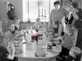
Give me fiveby marvinComment by Art Roflmao: struggling, searching, noticing something colored... Oh, it's a 5th birthday party!
To be honest, aside from the challenge tie in, it's a so-so snapshot at best. Can really only see about half the faces, none of the people are smiling much. Focus is good except on the fast-moving kid at the end of the table. Then there's the selective desat which looks more like an attempt to make sure people see the challenge relevance - like if you could've drawn a red arrow pointing to the cake, you would've done that. It doesn't work at all for me in an artistic way. If the challenge tie-in is not obvious, it is best to plainly put it in the title, preferebly in a short and clever way.
Hang in there though!
Hope this was helpful. |
| Photographer found comment helpful. |
| 05/10/2005 07:12:53 AM |
Give me fiveby marvinComment by Chinabun: there is way to much goin on in this picture, even with the cake in color i still didnt notice it. |
| Photographer found comment helpful. |
| 05/10/2005 04:28:35 AM |
|
| Photographer found comment helpful. |
| 05/09/2005 10:06:02 PM |
|
| Photographer found comment helpful. |
| 05/09/2005 10:17:02 AM |
|
| Photographer found comment helpful. |
| 05/08/2005 11:51:11 PM |
Give me fiveby marvinComment by love: omg what a great candid!! I will bet this will end up at the bottom of the heap but i think it's so FUN!! 8 |
| Photographer found comment helpful. |
| 05/08/2005 11:02:56 PM |
|
| Photographer found comment helpful. |
| 05/08/2005 06:15:41 PM |
|
| Photographer found comment helpful. |
| 05/08/2005 01:57:00 PM |
Give me fiveby marvinComment by Blinks: I like your use of selective desaturation here. I wish the cake had less things cluttered around it on the table so I would be seen easier. |
| Photographer found comment helpful. |
Home -
Challenges -
Community -
League -
Photos -
Cameras -
Lenses -
Learn -
Help -
Terms of Use -
Privacy -
Top ^
DPChallenge, and website content and design, Copyright © 2001-2026 Challenging Technologies, LLC.
All digital photo copyrights belong to the photographers and may not be used without permission.
Current Server Time: 07/17/2026 11:09:24 AM EDT.