Damn itby
marvinComment by strangeghost: Greetings from the Critique Club
by strangeghost
The first three parts of this critique are written based purely on examination of your photo. "Final thoughts" is written after reviewing your score, photographer's comments, and voter comments.
TECHNIQUE
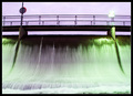
I confess that I've struggled with this picture for quite awhile tonight. Frankly, I can't decide exactly what it is that bothers me about it. The motion blur in the moving water is nice, but the glaring, blown out green light is pretty harsh, as is the blown out sign (?) directly above it. The bridge looks a little too dark compared with the rest of the scene. The bright sky behind combines to create a whole pic where the lighting just somehow seems
off.
COMPOSITION
The composition seems to be fairly plain and uninspiring. This is odd because flowing water generally has a pleasing feel to it, but this somehow feels a little abrasive or prickly. There's some nice symmetry with the posts, the signs, etc., but I don't feel any particular message coming from the comp. In relation to the challenge, I don't see an obvious connection to the odd couple. Dam and bridge? Water and walkway? Seems like you're stretching and not connecting.
EMOTIONAL IMPACT
None that really strikes me. There's nothing unusual or evocative that captures the imagination. No dynamic elements or tension implied. No real subject that grabs the eye and holds it, or lines that gently lead me to devour the elements. I think I don't really "get it."
FINAL THOUGHTS
I appreciate your humorous response to your commenters. It seems that most, by far, were perplexed by the relationship to the challenge, but many liked the photo, or at least were not as bothered by the technical elements as I was. In your photographer's comment, you say that you used USM to increase the saturation. I'm familiar with the oversharpening technique where you crank the amount down and the radius way up to boost contrast, is that what you mean (USM 35/100/2, for example?)? If so, you may have not had enough contrast and hue to begin with. Your final score of 4.34 reflects the voters' overall blase' attitude toward your image. You just didn't tickle their - or my - fancy with this interesting shot.