DPChallenge: A Digital Photography Contest You are not logged in. (log in or register
 
Browse Settings
Currently viewing:
Registered Usermarvin

Show comments:

Per page:

Order:

Comments:


Comments Received by marvin
Pages:   ... [105] [106] [107] [108] [109] [110] [111] ... [212]
Showing 1071 - 1080 of ~2114
Image Comment
Meltdown
06/04/2006 04:31:53 AM
Meltdown
by marvin

Comment by hanneke:
Hello, Greetings from the Critique Club.

As requested, here is an indepth critique of your submission. Please keep in mind this is a personal opinion.

First Impression - the most important one:
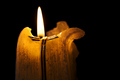
Nice shapes in the candle. The colors work for me.

Composition:
You used the 1/3 rule in your photo, but it looks a bit dull to me.

Subject:
It fits the challenge, but you might have played around with the suet (?), bend and shape it, so it becomes a bit more interesting for the voters.

Technical (Color, focus, and light):
Focus: focus looks good, allthough it might have been better to use a smaller aperture and have the flame in focus too. But I'm not sure, and you've probably tried that too.
Color: colors look allright to me. The pure black background works great with your image.
Light: The light of the candle is ok, and you did good to not use another fill-light or something like that.

I think this image looks good enough as it is, but it might have been a bit boring for the voters. A little experimenting with the candle (if you'd like to do that, of course) might have worked.

I hope you've found this critique helpful. Good luck with future challenges!
Photographer found comment helpful.
House of faith
06/04/2006 01:53:33 AM
House of faith
by marvin

Comment by caba:
The leaning house of faith, bg
Photographer found comment helpful.
House of faith
06/02/2006 05:09:54 PM
House of faith
by marvin

Comment by MTPixels:
Great image, nice lighting, and structure, but the camera angle makes this unbalanced to my eye.
Photographer found comment helpful.
House of faith
06/01/2006 07:52:18 AM
House of faith
by marvin

Comment by Djabordjabor:
The Landcodechurch :) The sky is too burnt out, the composition isn't very good and the sharpness is weird. Next time, try to have the composition as simple as you can.

You get some points for being Icelandic.
Photographer found comment helpful.
House of faith
05/31/2006 10:14:20 PM
House of faith
by marvin

Comment by MWitt:
Great Shot!
Photographer found comment helpful.
House of faith
05/30/2006 04:49:06 AM
House of faith
by marvin

Comment by BrianR:
Starnge lean ...5
House of faith
05/29/2006 03:01:07 PM
House of faith
by marvin

Comment by KarenNfld:
Image looks a little soft. Not very fond of the angle and your blues look unnatural (over saturated maybe?)
Photographer found comment helpful.
C for Canon
05/29/2006 02:24:13 PM
C for Canon
by marvin

Comment by rex:
Greetings from the Critique Club!!!!

Technical The DOF is almost perfect and the focus is spot on. I can really see all the small detail in the lenscap.

Lighting The lighting is great. I can see the word Canon real good. I just wish the whole word was in focus.

Composition Compositon is good. You have compoased it to make it an interesting shot. Very nicely done.

MY opinion is that you have a very good image of a lens cap. I like the detail and the lighting and the nice colors the sorta blueish color is a very nice color to look at. You havbe executed well in my opinion.
Photographer found comment helpful.
Meltdown
05/28/2006 10:08:02 PM
Meltdown
by marvin

Comment by Ivory:
Love the simplicity of this shot and the pure black background, good luck with it.
Photographer found comment helpful.
The attack of the giant teenager
05/27/2006 03:28:58 AM
The attack of the giant teenager
by marvin

Comment by kari1:
::: Critique Club :::

Hi, my name is Kari and from the critique club.

First Impression - the most important one:
I thought she might be practising karate or something nasty like that.

Composition:
I like it ... for me you coold have cropped some of the building at the back a bit and put the girl on verticla thirds on the left had of the shot .. and created a slightly more powerful shot .. that way you don't loose the environment and keep the pink socks totally in sync.

Subject:
ok some have said DNMC .. but I say this is a kid and yes it does!

Technical (Colour and light):
Natural light ... always appreciate that ... she is red in the face so you made her jump lots! .. you mean person.

To grow its vote?:
I think this shot was a challenge for you and so different from others in your portfolio .. keep doing that and challenging yourself outside your comfortzone.

Summary:
Great work ... can only see good in your future .. keep it up.

If you've got any questions about this critique, please feel free to contact me via the PM system.

Cheers

Kari
Pages:   ... [105] [106] [107] [108] [109] [110] [111] ... [212]
Showing 1071 - 1080 of ~2114


Home - Challenges - Community - League - Photos - Cameras - Lenses - Learn - Help - Terms of Use - Privacy - Top ^
DPChallenge, and website content and design, Copyright © 2001-2025 Challenging Technologies, LLC.
All digital photo copyrights belong to the photographers and may not be used without permission.
Current Server Time: 09/10/2025 01:42:48 PM EDT.