| Image |
Comment |
| 04/01/2005 08:34:27 AM |
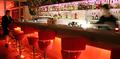
Nighthawkby MatthewComment by rex: Nice work. You have pulled out almost all of your faults in the comments sections. The light and the shadow. The man at the end could be a little better on focus. I didn't vote in this challenge but from what I see 71st place out of 249 is good. I have never placed that high. Anyway back to the shot. I noticed that a few commenters stated that this didn't portray boring to them. As I look at it I think of lonliness. It is a good shot with nice bright colors, perhaps too bright. But you have potential and good work on framing your subject here. I look forward to seeing more of your work as you progress. |
 Photographer found comment helpful. Photographer found comment helpful. |
| 04/01/2005 06:46:50 AM |
|
| Photographer found comment helpful. |
| 03/31/2005 07:21:38 PM |
|
| 03/31/2005 02:26:59 PM |
|
| Photographer found comment helpful. |
| 03/31/2005 02:26:09 PM |
Nighthawkby MatthewComment by RulerZigzag: nice shot , I like the bar....perhaps a 6 second exposure was a bit too much for this, it's not overexposed, but maybe too rich in color. |
| Photographer found comment helpful. |
| 03/30/2005 04:34:43 PM |
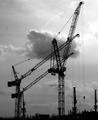
Foundationby MatthewComment by Simonkasprzak: I like this photo, I like to compostition, the placement of the towers, and i Love the idea in this one. I really like the thought that got this one took. Nice idea of using the 'beginning of development of a building'. 8 |
| Photographer found comment helpful. |
| 03/30/2005 11:46:11 AM |
Posterityby MatthewComment by rex: I am making two passes on this Challenge. I will vote on your photo then return later(before voting is over) to comment on what I like and dislike about your shot. You can take the comments however you wish and I will try not to be mean. Just don't take it the wrong way.
--------------------------------------------------------------------------------------------------------------
Good work. One where the subject being cut off in the photo works for me. Bumping up. |
| Photographer found comment helpful. |
| 03/30/2005 09:42:32 AM |
Foundationby MatthewComment by KarANN: This is neat...I like the way you caught this image..I also like the background its very pretty. I also like how everything is black on a grayish background/ |
| Photographer found comment helpful. |
| 03/30/2005 09:34:41 AM |
Foundationby MatthewComment by aznym: Looks like what I see from my balcony these days. New building coming up from every all directions. The idea is good, but I am not sure if you have captured it well here. Will definitely have a second look. |
| Photographer found comment helpful. |
| 03/30/2005 12:27:18 AM |
Foundationby MatthewComment by metoecus: Because of the odd box on the end of each crane head these look like wireframe urban dinosaurs. |
| Photographer found comment helpful. |
Home -
Challenges -
Community -
League -
Photos -
Cameras -
Lenses -
Learn -
Help -
Terms of Use -
Privacy -
Top ^
DPChallenge, and website content and design, Copyright © 2001-2026 Challenging Technologies, LLC.
All digital photo copyrights belong to the photographers and may not be used without permission.
Current Server Time: 06/25/2026 09:12:11 AM EDT.