| Image |
Comment |
| 01/04/2006 12:16:54 PM |
|
 Photographer found comment helpful. Photographer found comment helpful. |
| 01/04/2006 12:15:16 PM |
|
| Photographer found comment helpful. |
| 12/10/2005 03:46:27 PM |
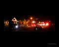
untitledby sofapComment by puma: 634 views and no comments. That is not right for a photo as good as this. This could be the cover of a comic book. Nice work |
| Photographer found comment helpful. |
| 12/05/2005 08:05:41 AM |
|
| Photographer found comment helpful. |
| 12/03/2005 02:36:38 PM |
|
| Photographer found comment helpful. |
| 11/06/2005 11:45:22 AM |
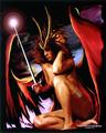
untitledby sofapComment by Jutilda: I think I'd take off the jewelry. IT's a tad distracting. I would like it more if the skin tones were really smooth and not grainy. Neat Image might fix that. The lighting is good and the arm across exposing a single breast is interesting. |
| Photographer found comment helpful. |
| 11/06/2005 10:12:11 AM |
|
| Photographer found comment helpful. |
| 10/22/2005 11:30:07 PM |
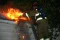
OUCHby sofapComment by digidori: You could have really confused the viewer if you had cropped in and captured a different angle. |
| Photographer found comment helpful. |
| 10/21/2005 07:46:32 PM |
|
| Photographer found comment helpful. |
| 10/19/2005 06:59:18 AM |
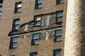
OUCHby sofapComment by cheekymunky: Would have made an interesting B+W study. The different colours of brick would have come out great. Interesting shot |
| Photographer found comment helpful. |
Home -
Challenges -
Community -
League -
Photos -
Cameras -
Lenses -
Learn -
Help -
Terms of Use -
Privacy -
Top ^
DPChallenge, and website content and design, Copyright © 2001-2026 Challenging Technologies, LLC.
All digital photo copyrights belong to the photographers and may not be used without permission.
Current Server Time: 07/16/2026 12:41:05 AM EDT.