| Image |
Comment |
| 01/27/2003 09:46:30 PM |
|
| 01/27/2003 02:53:13 PM |
|
| 01/27/2003 02:29:37 PM |
|
| 01/27/2003 12:47:39 PM |
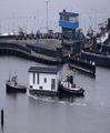
Too square for a houseboatby johnmkComment by dadas115: Wow what an interesting picture! For me this was one to the top two this week. Those boats look so unusual. I am wondering did you compress the image to make the house a square or was it really like that. The way the boats look leads me to think it was, but if you did compress it, you did a good job because it isn’t so compressed to be blatantly obvious. Those boats look like something from a cartoon. You made good use of contrast here, with your subject being much brighter than the surrounding picture. I also find myself enjoying the blue in the tower. They both stand out very well on what looks to have been a dreary day. I don’t know if this would have been possible but the only think I might try if I were to change this picture would be to crop it so the boats had some more water in front of them to go into. Overall I think you had strong composition here with the lines of the land drawing my eyes into the picture with the blue and white squares there to catch my attention and hold it.
Great work!
Greg
|
| 01/27/2003 03:36:39 AM |
|
| 01/14/2003 01:33:35 PM |
Tulips from Amsterdamby johnmkComment by teachme53: The flowers are beautiful, the idea excellent, but three things bother me about this picture. (1) The flowers are bunched together. (2)The majority of the flower are on the same level. (3)The lighting on the flowers, although good, could have been better. If you would have taken a few of the flowers out of the vase and placed the remaining ones at varying heights the viewers eye would have moved around the picture more. As it is, the eye follows the line of flowers down and off the page and we miss some of the intricate beauty that you captured. As far as the lighting is concerned, I assume you used available light. If so then it becomes even more important that you thin out the flowers for maximum use of the light. Pleased do not feel this critique is a cut-down of your work. You obviously put a lot of thought and effort into this photo and I,m just trying to make suggestions that might help in the future. JG |
 Photographer found comment helpful. Photographer found comment helpful. |
| 01/12/2003 11:57:18 PM |
|
| 01/12/2003 08:06:33 PM |
|
| 01/12/2003 07:08:53 PM |
Tulips from Amsterdamby johnmkComment by HBunch: I really like how you set this up, with the tulips overlooking the city. The only thing I'm noticing about this shot is that the window(?) is dirty. There are some spots that look like water spots all over. Otherwise, a very nice shot. Angle and framing/cropping are good and the focus is also very nice. Good luck in the challenge. |
| Photographer found comment helpful. |
| 01/11/2003 10:13:50 AM |
Tulips from Amsterdamby johnmkComment by PTLParsons: Beautiful tulips. Looks like it might be raining in the city. I would loved to have been able to see the city better in the background, not necessarily much darker, but better in focus. But's it's still a great photo. Worth a 7. PTL |
| Photographer found comment helpful. |
Home -
Challenges -
Community -
League -
Photos -
Cameras -
Lenses -
Learn -
Help -
Terms of Use -
Privacy -
Top ^
DPChallenge, and website content and design, Copyright © 2001-2026 Challenging Technologies, LLC.
All digital photo copyrights belong to the photographers and may not be used without permission.
Current Server Time: 07/17/2026 12:16:23 AM EDT.