| Image |
Comment |
| 03/26/2003 02:32:01 PM |
|
| 03/26/2003 02:06:26 PM |
|
 Photographer found comment helpful. Photographer found comment helpful. |
| 03/25/2003 02:38:15 PM |
|
| Photographer found comment helpful. |
| 03/24/2003 05:50:39 PM |
|
| Photographer found comment helpful. |
| 03/23/2003 09:23:42 PM |
|
| 03/22/2003 11:29:20 AM |
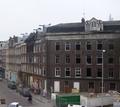
Hey, wrong entrance!by johnmkComment by Kaz: Nice detail and lines. I like it even more when I drag it partially off my screen and eliminate the guy and hands on the right. JMO. :) |
| Photographer found comment helpful. |
| 03/22/2003 08:47:29 AM |
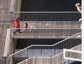
Tea-timeby johnmkComment by bod: Nice clean image, maybe a little overlit at the top. I love the striped reflections on the chrome, very good. |
| Photographer found comment helpful. |
| 03/21/2003 11:53:44 PM |
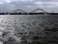
Crossing the wavesby johnmkComment by DougPaz: Greetings from the Critique Club };-)
Initial thoughts
Beautiful bridge, meets the challenge, a little too much water in foreground.
Composition/ Content
I really like this bridge a lot. That being said, I wish I could see it a little better. There is a bit too much water and not enough bridge. I don't know for sure if you have enough lens or there is a place to get close enough to it but a closer shot would be great. If not possible then you need to crop about half of the foreground water and make more of a panorama shot.
Technical
Focus seems good but the contrast seems like it could be turned up just a bit to make the bridge stand out against the sky more. A blue sky would be great but it is awfully hard to control the weather!
My Opinion On The Photo
I originally scored this shot a six which was a touch higher than most of the voters. I think that it meets the challenge well but could have been improved a little to finish even higher than it did. Good job, and keep up the good work.
I would be happy to talk further about this shot if you would like to contact me.
DougPaz
|
| 03/21/2003 01:15:26 PM |
|
| 03/21/2003 09:02:15 AM |
Hey, wrong entrance!by johnmkComment by dsidwell: This image certainly fits the challenge this week. I also like the varioud lines that lead the eye to different parts of the image. With more engaging light, the photo would be far more interesting, I feel. |
Home -
Challenges -
Community -
League -
Photos -
Cameras -
Lenses -
Learn -
Help -
Terms of Use -
Privacy -
Top ^
DPChallenge, and website content and design, Copyright © 2001-2026 Challenging Technologies, LLC.
All digital photo copyrights belong to the photographers and may not be used without permission.
Current Server Time: 07/16/2026 10:42:36 PM EDT.