Peaceful symmetryby
johnmkComment by dsidwell: Greetings from the Critique Club!
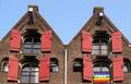
This is a nice image that is indeed peaceful. You've got a lot of horizontal and round lines from the brick work that add to this feel, and since the vertical lines from the shutters aren't that pronounced, they don't detract from it. Even your diagonal roof lines do not totally break the peaceful nature of the shot, perhaps because they are capped by horizontal additions at the top. The soft colors of the bricks also help.
The image to me is symmetrical, and I don't mind the flag in terms of symmetry; I guess I'm pretty liberal when it comes to symmetry and can accept a softer symmetrical look. I also find the buildings well positioned in the frame, though as many of your commenters noted, it does appear slightly tilted due to the "keystoning" of looking up. If you look at the bricks at the bottom of the frame, they look level, but looking up skews and warps the image. The only way to combat this is to get either closer or farther away and make sure you're exactly in the middle. I would guess that you were slightly to the right of the symmetrical plane in the center: note how the extreme left of your image is also slightly more out of focus than the right. So tilting it in Photoshop would not work as the image is warped and not tilted at all. You could also crop the outside edges more to eliminate the worst of the distortion.
The flag adds a bit of interesting color, but like other voters, I feel it tends to compete for attention rather than augment the photo.
Light: I notice that your aperture was at f 2.6. Setting that higher, perhaps to 8.0 or so, would both increase your depth of field and lower the light entering your camera. I'm not sure you can do that with your camera, but many cameras allow you set the aperture. I find the light in this photo a bit harsh and uninteresting. Coming at a different time of day or increasing the shutter speed to limit the light that enters the camera would both darken and enliven the shot, I feel. The reds of the bricks and shutters could really come to life in the right light.
I like the composition of this photo and enjoy how the sky balances the image at the top. Nicely cropped and well positioned in the frame. I also enjoy the various lines of the windows that you captured here.
The photo seems slightly out of focus, and perhaps running an Unsharp Mask filter would help, if you have Photoshop. You may not want to always trust your camera's autofocus. Increasing the aperture might help with overall focus as well.
In sum, I like the image: you've chosen a good subject and communicate a nice sense of symmetry through it. I find it well composed and cropped. I do feel it needs that last spark of interest that could be added through more interesting light, which would be my main suggestion for improvement.
Thanks for letting me look!
David