| Image |
Comment |
| 02/17/2003 04:34:38 PM |
|
 Photographer found comment helpful. Photographer found comment helpful. |
| 02/17/2003 04:12:12 PM |
|
| Photographer found comment helpful. |
| 02/17/2003 02:26:25 PM |
|
| Photographer found comment helpful. |
| 02/17/2003 02:47:07 AM |
|
| Photographer found comment helpful. |
| 02/17/2003 01:05:55 AM |
Mariachi Rythmby JEMComment by tomzinho: from a photo perspective, this is nothing special. from a capturing the theme perspective, this is one of my highest voted photos this week. i might have cropped the top a little lower and the bottom a little higher to give greater focus on the combined subject. congrats! nice photo. |
| Photographer found comment helpful. |
| 01/16/2003 01:16:08 AM |
Blowing In The Windby JEMComment by ambaker: Critique Club review
Interesting composition. The musician seems lost in his music, while the listener, if he is even listening, seems displeased, and looks like he waiting for someone off camera. The biggest fault I see with this photo is the position of the tree behind the musician. It appears to be growing out of his head. A different camera angle would have helped here, or if it was a posed shot, repositioning the models.
Considering the title, I think positioning the camera more to the right, so as to avoid the intrusion of the window and the tree behind the head, and possibly elminating the passerby would lead to a stronger photo. This would have put more focus on the musician, which is the strongest element here.
In this photo, the over all exposure is good. The colors are a little bit cool. The bricks have almost a blue cast to them. However, saturation is good. Contrast is very good. Depth of field and sharpness are excellent. |
| Photographer found comment helpful. |
| 01/14/2003 07:47:57 PM |
Alicia In Wonderlandby JEMComment by DougPaz: Greetings from the Critique Club };-)
Initial thoughts
Beautiful color, great expression, seems a bit grainy
Composition/ Content
I am really surprised this scored as low as it did. I assume that folks didn't get the connection to the challenge. I felt that the little girl in COSTCO was in a place that she didn't want to really be, thus the look. The red in the shot is great, I like the way it all matches the handle on the buggy. I think you may have improved the composition a bit by making it a portrait instead of a landscape. If you cropped it just left of the black box in the upper right you still would have her and the expression and the handle. I think it may have improved it some.
Background
As mentioned it is just a bit busy. May have been better cropped out.
Camera Work - Technical
Focus is good and the lighting really good for a shot in a store like this.
Digital Processing - Technical
Here is where I think you could have really improved the shot. I mentioned the cropping but the biggest thing is that you only used 72kb of the 150kb allowed by the rules. The additional pixels would have really sharpened this shot up. I think there may be a few jpeg artifacts as well.
Fits The Challenge
After a little thought it fits the challenge.
My Opinion On The Photo
I originally scored this shot a six which was on the high end of the voters. I think that it meets the challenge but could have been improved a little to finish even higher than it did. Good job, and keep up the good work.
I would be happy to talk further about this shot if you would like to contact me.
DougPaz
|
| Photographer found comment helpful. |
| 01/12/2003 08:18:15 PM |
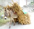
Traveling Through Hidalgoby JEMComment by lionelm: Critique Club
INITIAL RESPONSE: Good composition, nice colors, look overexposed
COMPOSITION-CONTENT - The composition and the content seems very good to me. But even to suggest to say with a heavy sun I think the background is too bright (The donkey by itself is fine).
The wall looks pure white and we're missing details and coors on the cushion.
I think you brought the right items for this composition .
I like a lot the story it tells and the animal is in a nice osition.
Color would be deeper as well (except if it does not convey what you wanted to convey). I would definitly try some leevl adjustement.
BACKGROUND : Significant in the 'story telling' part of the picture. too bright really even if that way it detach the donkey more.
CAMERA WORK-TECHNICAL- See above. I think the exposure (if you do not have any processing) is too high. The wall in the background seems all pure white pixels without details.
DIGITAL PROCESSING - TECHNICAL - Could afford some processing to adjust the levels.
MY OPINION ON THE PHOTO - I like the shot but I am really distracted and bothered by the overexposed part of the picture. The story and the very good framing still make it a nice picture.
Lionel Message edited by author 2003-01-12 20:18:28. |
| Photographer found comment helpful. |
| 01/10/2003 05:41:41 PM |
Alicia In Wonderlandby JEMComment by PTLParsons: That expression is priceless. You take the prize for that one. She is lost in her own world, strange or not. This is an 8 all the way. PTL |
| Photographer found comment helpful. |
| 01/09/2003 03:22:55 PM |
Alicia In Wonderlandby JEMComment by BadPigg: After seeing the Costco logo, and thinking about this from the childs perspective I think this fits the challenge perfectly. The dark rectangle in the upper right hand detracts from the image. |
| Photographer found comment helpful. |
Home -
Challenges -
Community -
League -
Photos -
Cameras -
Lenses -
Learn -
Help -
Terms of Use -
Privacy -
Top ^
DPChallenge, and website content and design, Copyright © 2001-2026 Challenging Technologies, LLC.
All digital photo copyrights belong to the photographers and may not be used without permission.
Current Server Time: 07/16/2026 01:58:29 AM EDT.