Tomato On The Vineby
STEINRComment by HBunch: *Critique Club*
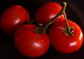
Am I missing something here? I thought that the compliment to orange is blue? I think this would have worked well in the secondary colors challenge. Where secondary colors are Orange and Green (and purple, which doesn't apply here).
Anyway, Setting that aside to talk about the photo itself...
It's a very good image. I think it may need a bit more lighting. I think that the lighting on the stems is a bit dark, and even if they had been an important color in this shot, they would be a bit dark to really bring the color out to the full potential anyway.
The color of the tomato is really good. I think that the orange stands out very nicely here. It is strong, and vivid, and very effective on the topic of color. However, when talking about complimentary, I feel that there needs to be 2 strong colors, and the green (even if it WAS the compliment of orange) is not strong enough to qualify for this.
Focus and clarity are really good. I think that you show us good detail in the stem and the smoothe texture of the tomato really stands out nicely.
I like the set up. The angle and framing/cropping you have chosen for these garden goodies is really good. I think that the way the area setting is good. I only wonder though if you could have not cropped the left tomato, or have cropped it more. Right now, you just barely shave off a bit of the tomato, and have not cropped any of the other ones, so it almost looks like a bit of an accident. Not really anything that was done for a reason.
Maybe a side light shining right on the stems (so it misses the tomato) would help the stems to shine more, and not put too much lighting on the shiny tomato.
Yummy looking for sure.
~Heather~