Christmas Stockby
mcraelComment by HBunch: *Critique Club*
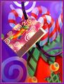
There sure is a lot of color in this shot. Too much color, I believe. There are Purple, Orange and Green. Which are the secondary colors. However, there is also White, Black, Red, Yellow and blue.
If you are taking a photo of a jar, if you want that jar to be the main object, you do not surround it by other jars which are just as pretty.
I think that is the mistake you made here. While your secondary colors are pretty, the surrounding colors make those specific colors less important.
Your focus and clarity are great. I also think that because of the pattern on the paper, and the effects which are printed ON the paper, that it makes it look like you were able to accomplish 'special effects' in this shot. When really it is the actual print, not what you have done.
For example, the tag looks like it has some really great lighting effects on it, but that is just printed ON the tag, and actually the lighting isn't that great. On the subject, it's Ok, but look inside the tag. In the middle of all these pretty colors, there is a horrible dark shadow that really does nothing for the shot.
The angle and framing/cropping are really good. I do like very much how the subject fills the entire frame, and how you have included the tag and rope in the photo as well.
The colors are really vivid and stand out wonderfully, however, not for the purpose of the challenge.
Still quite pretty, and I think I could see this on a card or party invite.
~Heather~