DPChallenge: A Digital Photography Contest You are not logged in. (log in or register
 
Browse Settings
Currently viewing:
Registered Userzagman

Show comments:

Per page:

Order:

Comments:


Comments Received by zagman
Pages:   ...
Showing 181 - 190 of ~225
Image Comment
The Look
04/05/2005 08:23:13 PM
The Look
by zagman

Comment by SandyP:
Awwwwwwwww. . . . she looks a little like my Lacey!!! I love her!!!
The Look
04/05/2005 10:47:01 AM
The Look
by zagman

Comment by clarmore:
This is my second go-around =) - Awh... what a cutie! I think we can all relate to getting "the look" from our dogs =) haha. I think your pup's eye was dodged too much... it looks too light and the contrast is really low on it (the pupil shoudl be black. I think that is very distracting since the eyes are normally the focus of a portrait... people tend to look at the eyes first. Otherwise, I really like your idea for the contest and I think you overall did really good =)
The Look
04/04/2005 03:26:38 AM
The Look
by zagman

Comment by kiwinick:
Oh a King Charles we have A Ruby called Ruby
Morning Glory
03/19/2005 01:26:10 PM
Morning Glory
by zagman

Comment by dr rick:
Greetings from the Critique Club!

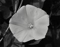
This is an attractive photo, but lacks impact. The main problem is that the focus isn't perfect. A tripod would probably help, but may be difficult to take into a botanical garden. Focus is critical for close-ups and slight movement of the camera toward or away from the flower after focus lock and before the shutter release will throw off the focus. Trying to correct for the poor focus by sharpening has resulted in distracting halos around the stamen and edges of the flower.

The other problem with this photo is lack of tonal range and contrast. This is best fixed with Curves; I'm not an expert at that tool myself, but I personally like the effect of a curve with four points: (0,0), (60,45), (170,190), and (202,255).

On the positive side, the lighting works well here. Although on the verge of being too harsh, it's not, and the shadow of the stamen is interesting and attractive. The not-quite-head-on point of view is also effective, fully revealing one of the spots at the center and parts of others, while maintaining the overall shape and symmetry of the flower. And I certainly think you achieved your goal of focusing on the beauty of a single flower while showing its context.
Surreal World
03/15/2005 02:36:19 PM
Surreal World
by zagman

Comment by waterlilies:
I wish that ball of wire were sharper.
Surreal World
03/15/2005 10:17:31 AM
Surreal World
by zagman

Comment by grainman9:
It's really satisfying to see this as you understand surrealism. tightly cropped and depth of field problem but elements and composition are making up for them.
Surreal World
03/15/2005 08:40:12 AM
Surreal World
by zagman

Comment by judibrenstein:
Cropped a little too close at the top IMO.
Lines = Curves
03/14/2005 04:50:32 PM
Lines = Curves
by zagman

Comment by srbrubaker:
Cute. I normally prefer things with crisp architectural lines, or things from the natural world, but the exposure here is photoworthy.
Lines = Curves
03/14/2005 01:14:36 PM
Lines = Curves
by zagman

Comment by mmckenna:
Is this a dirty old man candid or did you actually get model consent?
Surreal World
03/14/2005 12:28:12 PM
Surreal World
by zagman

Comment by EaThis:
good composition. The tumbleweed ball thing is a bit cut off at the top, so maybe a bit more headroom in this and it would be good.
Pages:   ...
Showing 181 - 190 of ~225


Home - Challenges - Community - League - Photos - Cameras - Lenses - Learn - Help - Terms of Use - Privacy - Top ^
DPChallenge, and website content and design, Copyright © 2001-2025 Challenging Technologies, LLC.
All digital photo copyrights belong to the photographers and may not be used without permission.
Current Server Time: 08/04/2025 04:46:46 PM EDT.