| Image |
Comment |
| 11/09/2005 03:45:11 PM |
"Serenity"by tmorninglory96Comment by cosmic: Striking colours with nice composition and exposure. I think I would have moved a step to the left to eliminate that barn(?) in the distance. Actually... lol maybe not. Then you'd miss that gorgeous orange tree back there. Good luck with this one! |
 Photographer found comment helpful. Photographer found comment helpful. |
| 11/09/2005 12:43:48 AM |
|
| Photographer found comment helpful. |
| 11/09/2005 12:36:28 AM |
|
| Photographer found comment helpful. |
| 11/04/2005 08:41:12 AM |
"Freedom"by tmorninglory96Comment by Jutilda: AWESOME!!! The clouds are spectacular. The minimal ground with the upstretched arms of the figure makes for a perfect composition. The trees arching up and over make for a great natural frame. Great job. |
| Photographer found comment helpful. |
| 11/03/2005 04:10:15 PM |
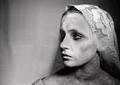
"Until Death Did We Part"by tmorninglory96Comment by SteveJ: Greetings from the Critique Club:
The challenge, Image Grain, was to use grain or noise to enhance your photo. Yoy did this well.
Technical:
The added grain looks pretty good on the background. Can't quite work out the pattern on the background, perhaps flowery curtains? There are blown out highlights on the nose and forehead which do detract from the dark look, had this been kept darker it would have added to the overall effect. I am guessing that a certain amount of burning was done around the eyes, cheek bones and neck. In my opinion the neck and shoulders area have been over burned and the result is almost a dirty look, rather than a shadowy look.
Composition:
Nicely composed with subject(daughter) being positioned to the right...makes you wonder what she is looking at approaching from the left. I can't find any faults with composition, the 'veil' fits well as does the brief glimpse of a dress on the shoulder. This reminds me of the French Revolution type picture.
Personal:
Apart from the things I mentioned earlier, there is a lot going for this photo, maybe worth a reshoot. Try to even up the exposure on the neck and shoulder with the face, avoiding those blown highlights and this is a winner. The whites of the eyes could be lifted slightly. All in all a fair result for what could have been a really high scorer. Hope this is helpful and constructive.
Steve |
| Photographer found comment helpful. |
| 10/28/2005 06:38:03 PM |
"Until Death Did We Part"by tmorninglory96Comment by ubique: It's sackcloth and ashes, of course ... and, in view of the title, in this case it's for mourning rather than pentinence. That makes me nervous about commenting freely, because it looks real rather than simulated. It makes a stark and arresting image. The lighting is beautiful, the composition is simple yet elegant, and the processing, including the use of grain, is sympathetic to the mood and the subject. 8 |
| Photographer found comment helpful. |
| 10/28/2005 03:42:00 AM |
|
| Photographer found comment helpful. |
| 10/27/2005 10:13:16 PM |
|
| Photographer found comment helpful. |
| 10/27/2005 02:05:42 PM |
"Until Death Did We Part"by tmorninglory96Comment by kiwiness: Nice processing! I know you wanted the eye at the back to be dark but on my TFT monitor it looks like her eye is closed and the eyelash is pointing unnaturally downwards. But these monitors show everything up way too bright anyway. |
| Photographer found comment helpful. |
| 10/26/2005 04:53:29 PM |
|
| Photographer found comment helpful. |
Home -
Challenges -
Community -
League -
Photos -
Cameras -
Lenses -
Learn -
Help -
Terms of Use -
Privacy -
Top ^
DPChallenge, and website content and design, Copyright © 2001-2026 Challenging Technologies, LLC.
All digital photo copyrights belong to the photographers and may not be used without permission.
Current Server Time: 07/16/2026 04:18:26 PM EDT.