| Image |
Comment |
| 12/22/2007 08:52:02 PM |
|
| 12/22/2007 05:01:43 PM |
|
| 12/22/2007 11:14:32 AM |
|
| 12/22/2007 09:35:30 AM |
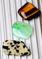
3stonesby ralphComment by UrfaK: the background seems slightly overexposed and distracts from the subjects of the picture.. |
| 12/22/2007 06:56:56 AM |
3stonesby ralphComment by andrewt: Would prefer a different perspective to the 3 stones and a different background - 5 |
| 12/21/2007 09:26:05 AM |
3stonesby ralphComment by fuzzyt: Great colors there, but I think different lighting would have helped to bring out some dimension. |
| 12/20/2007 11:40:36 PM |
3stonesby ralphComment by MaryO: The stones are nice, but the lighting is creating quite a bit of glare. |
| 12/20/2007 01:35:36 PM |
|
| 12/20/2007 12:52:40 PM |
negitive feedback !!! Will not buy from seller again!! by ralphComment by spencerwood: The composition seems a little awkward somehow, the text is very near to the bottom, you can see a very small amount of text just to the left of the "S" in Sun which could have been cropped out. I think that perhaps a simple macro of the sparks and motherboard without the case, text and blue surface in shot would have been a lot cleaner. The same simplification process could also be applied to the title, just "Negative Feedback" would have been spot on. |
| 12/20/2007 11:21:05 AM |
|
Home -
Challenges -
Community -
League -
Photos -
Cameras -
Lenses -
Learn -
Help -
Terms of Use -
Privacy -
Top ^
DPChallenge, and website content and design, Copyright © 2001-2026 Challenging Technologies, LLC.
All digital photo copyrights belong to the photographers and may not be used without permission.
Current Server Time: 05/10/2026 08:25:15 AM EDT.