| Image |
Comment |
| 06/01/2005 06:31:10 PM |
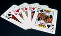
Hold 'em or Fold 'emby joansuzyComment by Arcanist: At first, the link to the challenge seems to elude me. However the cards are placed down, not held, face up, not down. The player has decided to revela the hand. A stretch for me, a weak link to the challenge as I feel no anticipation of a decision, no emotion charged with the image. Alone the cards are well shot, however the image at this size has suffered from compression artifacts or over sharpening. They are well placed against the negative space, but this is an excercise in cropping and light control. It does not keep my interest. Add some text in the lower left corner however and this image could become powerful as an advertisement or poster. A good capture, but lacking in the challenge links when compared to others in this round. I offer a 4. |
| 06/01/2005 02:33:21 AM |
|
 Photographer found comment helpful. Photographer found comment helpful. |
| 06/01/2005 12:24:42 AM |
|
| Photographer found comment helpful. |
| 06/01/2005 12:12:35 AM |
|
| Photographer found comment helpful. |
| 05/31/2005 09:47:29 PM |
|
| Photographer found comment helpful. |
| 05/31/2005 02:25:36 PM |
TOME BEAUTIESby joansuzyComment by LucidLotus: I love the color. The use of the different colored books was wonderful, and I do find it a beautiful collection. I also like the idea of something different than the usual nature/model image. I think the lighting however is a detriment. You definitely need good lighting to let all these rich colors pop through but the shine/glare that is reflecting off of them is very distracting and does harm the look I think you were going for. I think the focus is decent but could be better - its possible that the glare from the books is affecting this though. Finally, the only other thing I'd suggest changing would be a slight rotation so the books didn't appear to be leaning to the right, rather would be straight up and down. Other than those things I really like this entry and again I love the color shown! I gave a 6. |
| 05/30/2005 11:32:42 PM |
|
| Photographer found comment helpful. |
| 05/30/2005 02:11:39 PM |
TOME BEAUTIESby joansuzyComment by karmat: The lighting is a bit harsh on the left side, I believe, making it difficult to distinguish all the details in the covers |
| Photographer found comment helpful. |
| 05/30/2005 12:53:27 PM |
TOME BEAUTIESby joansuzyComment by joyinlight: Great idea- there is so much beauty in books- It would be more pleasing with more depth of shadow- Too much light takes away from the dark richness of the covers. |
| Photographer found comment helpful. |
| 05/30/2005 04:10:13 AM |
TOME BEAUTIESby joansuzyComment by Steveinnz: Original, great composition. I am not an expert on lighting but it seems not right in this photo, too glary?? |
| Photographer found comment helpful. |
Home -
Challenges -
Community -
League -
Photos -
Cameras -
Lenses -
Learn -
Help -
Terms of Use -
Privacy -
Top ^
DPChallenge, and website content and design, Copyright © 2001-2026 Challenging Technologies, LLC.
All digital photo copyrights belong to the photographers and may not be used without permission.
Current Server Time: 07/16/2026 03:24:36 AM EDT.