Floating in colorsby
TUBORGComment by kteach: Greetings from the Critique Club!
First Impression:
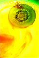
Very bright and bold colors, almost a bit hard to look at. I like the swirls of reds and how all the colors seem to mix into each other. The kiwi is a great focal point with all the little black seeds. I like that it is abstract yet you still know what you're looking at.
Composition/Background:
The portrait orientation here just feels a bit awkward to me. Thinking in the rule of thirds, this one seems to be almost split in half with the kiwi and the red colors, and the kiwi is almost centered in the top. Perhaps a slightly different crop would help?
Technicals:
The one thing that stand out to me technically is the focus. I like how the focus on the kiwi and bubbles is sharp, yet the rest of the photo is very soft.
Post Processing:
You didn't mention any of your post processing in your photographers notes which makes it difficult to comment on what was done. It looks as though the saturation was boosted, and the yellows are a bit overdone for my taste. There are also a few little dark spots of red that I might have cloned out if possible.
Hope you found this critique helpful! Please feel free to PM me if you have any questions.