Sin City
by
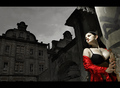
MephistoComment by truogre: *Critique Club*
Hi, my name is Russell and I am doing the critique that you requested!!
First off, let me say, this is REALLY a tough one!! Not only did you ribbon, I thought (personally) that it should have been first place.
What I liked - The idea and title is truly "nailed" (I too, am a big fan of the movie), so the composition is great. Your background is a perfect fit. Overall, it not only matches the challenge but exceeds it (again GREAT call on the movie)
What I didn't like - Now is where the critique gets tough - it is such a great shot, that anything mentioned here are strictly personal thoughts, so please take it for what it is worth.
The lighting above and to the right of the model lightens that section of wall making it a part of her vs a part of the setting.
The bird "pooh" could have been taken out or darkened a bit.
Overall, there is VERY little NOT to like here, the likely reason you came in second instead of first was due to the African child portrait, not overly creative, but very powerful in it's vision - I see alot of ribbons coming your way in the future!!
Russ