| Image |
Comment |
| 08/26/2004 01:17:15 PM |
|
| 08/26/2004 02:12:49 AM |
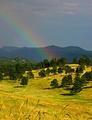
Hope for rain?by cathysappComment by risu81: I love the way the golds and the greens blend together. My eye is drawn to those colors more than the rainbow but I do no think it takes away from the shot. - 10 |
| 08/25/2004 09:11:16 PM |
|
| 08/25/2004 08:40:07 PM |
Hope for rain?by cathysappComment by joebok: Wonderful detail, sharpness, and color on the foreground! The composition seems too centered, with the hill in the middle - but I don't know how to suggest cropping? Maybe a little from the top as the grass in the foreground adds a lot of depth that I wouldn't want to lose. |
| 08/25/2004 02:25:46 PM |
Hope for rain?by cathysappComment by Dr.Confuser: Very very nice. I love the contrast between the meadows and the trees. The banding composition (1/3 sky, 1/3 mountains, and 1/3 meadow ... more or less) is effective. The subtle rainbow is a nice touch. I like that the DOF giave some grass in the foreground. Among my top picks. |
| 08/25/2004 02:23:14 PM |
|
| 08/25/2004 01:57:11 AM |
Hope for rain?by cathysappComment by teknon42: good work. the hue feels a little off and the grain greatly damages the image. perhaps slightly less saturation in the greens? |
| 08/24/2004 10:22:26 PM |
|
| 08/24/2004 08:40:33 PM |
|
| 08/24/2004 03:51:51 AM |
Unhealthy neon?by cathysappComment by maciupiciu: You foun a great neon sign, why didn't you play more with it? A little perspective... a dearing angle would have done grat on you foto. Now is gest too simple. |
Home -
Challenges -
Community -
League -
Photos -
Cameras -
Lenses -
Learn -
Help -
Terms of Use -
Privacy -
Top ^
DPChallenge, and website content and design, Copyright © 2001-2026 Challenging Technologies, LLC.
All digital photo copyrights belong to the photographers and may not be used without permission.
Current Server Time: 07/17/2026 05:42:09 PM EDT.