| Image |
Comment |
| 12/09/2002 09:59:24 PM |
Shades of blueby cathysappComment by Gracious: Some of the detail seems to be lost. Perhaps a different lighting might bring out some more of it. Lightening it in a photo editing program might work too.
The composition is simple and straightforward and that is one of the fine qualities of this image. The shape stands out nicely, though a little more contrast would make it really snappier. I think the blue background is fine, but again with a little more contrast it would be sharper.
OVerall this is nice, but needs a little snap to make it more appealing. |
| 12/08/2002 12:17:54 AM |
|
| 12/06/2002 11:24:16 PM |
Shades of blueby cathysappComment by PTLParsons: Beautiful va'se. It's a va'se not a vase. Good job of catching it's beauty. Technically good photo. Don't change a thing. Would have been as pretty with any solid soft background, even soft white. PTL 8 |
| 12/06/2002 12:03:34 AM |
|
| 12/02/2002 06:23:00 PM |
Shades of blueby cathysappComment by justine: That is one lovely vase. It looks old and expensive. Please don't tell you got it at Pier ONE. LOL Colbolt blue. Nice. Now your shot is good too, I do think it's a little dark. Maybe more lighting here. Nice work. Justine |
| 12/02/2002 12:08:00 PM |
|
| 12/02/2002 01:30:00 AM |
|
| 12/02/2002 12:50:00 AM |
Shades of blueby cathysappComment by Wes: I think a white background would have served this picture better than the light blue. Too much blue in the picture for me. (even though the challenge is blue) |
| 11/17/2002 07:37:00 PM |
|
| 11/16/2002 01:01:00 PM |
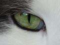
Window to my cat's soul.by cathysappComment by Jacko: Great close-up. I find the reflection a bit distracting though. Nothing you won't be able to fix later with PSP or photoshop. Good luck in the challenge. Jacko 8 |
Home -
Challenges -
Community -
League -
Photos -
Cameras -
Lenses -
Learn -
Help -
Terms of Use -
Privacy -
Top ^
DPChallenge, and website content and design, Copyright © 2001-2026 Challenging Technologies, LLC.
All digital photo copyrights belong to the photographers and may not be used without permission.
Current Server Time: 07/16/2026 09:01:21 AM EDT.