| Image |
Comment |
| 06/28/2005 08:23:06 PM |
to the oceanby U622Comment by dragonlady: lovely light and texture. the fence line with greenery leading to water is lovely..I like the shadows of fence on the sand also. |
 Photographer found comment helpful. Photographer found comment helpful. |
| 06/28/2005 01:10:00 AM |
to the oceanby U622Comment by saiphfire: I think this would have been better with more emphasis on the leading part... like a picture taken from above the fence, maybe. |
| 06/27/2005 12:05:27 AM |
to the oceanby U622Comment by Jutilda: So many great textures in this photo. Nice use of light and shadow. Maybe bring up the blue of the water a touch? |
| Photographer found comment helpful. |
| 06/26/2005 10:32:50 PM |
|
| Photographer found comment helpful. |
| 06/26/2005 08:39:36 PM |
|
| Photographer found comment helpful. |
| 06/25/2005 09:30:27 PM |
skylight.jpgby U622Comment by Jutilda: Love this architecture meets nature shot. Lovely composition. Great sky color. |
| Photographer found comment helpful. |
| 06/25/2005 10:03:45 AM |
hay rakeby U622Comment by RonBeam: Circles, crescents, triangles and straight lines; you've got it all here! And those textures are almost tangible. Well made ode to a bygone day in abstract form. 9. |
| Photographer found comment helpful. |
| 06/24/2005 12:02:13 AM |
hay rakeby U622Comment by PaigeS: Maybe a bit too busy with an uncertain focal point, I nonetheless appreciate the effort being from a pastoral realm myself. Rate: 4 |
| 06/23/2005 06:16:52 PM |
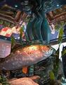
Atlantisby U622Comment by Artifacts: Decent color, detail and image quality. Composition is OK. Good subject for the challenge.
On the technical side the contrast is just a little weak and a simple autocontrast will add pop to the image. You might consider a color adjustment to add about 10-15% saturation to yellow, red and light blue for added viewer interest. A small amount of dodge and burn would give the image more texture. |
| Photographer found comment helpful. |
| 06/23/2005 05:18:20 PM |
|
| Photographer found comment helpful. |
Home -
Challenges -
Community -
League -
Photos -
Cameras -
Lenses -
Learn -
Help -
Terms of Use -
Privacy -
Top ^
DPChallenge, and website content and design, Copyright © 2001-2026 Challenging Technologies, LLC.
All digital photo copyrights belong to the photographers and may not be used without permission.
Current Server Time: 07/17/2026 12:34:49 AM EDT.