| Image |
Comment |
| 02/12/2006 08:34:59 PM |
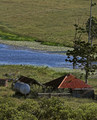
Broken & Windsweptby BrianRComment by sherpet: I really love this, as you can see that it has stood time really well, except for the aged and broken feel to the buildings. The overgrown grasses and shrubs add to it appearance, and its use by date. The blue creek or river, really adds interest to the windswept country scene..... Well done..... This would have also suited the "COUNTRY LIFE ll" challenge as well..... |
 Photographer found comment helpful. Photographer found comment helpful. |
| 02/11/2006 09:17:37 PM |
|
| Photographer found comment helpful. |
| 02/11/2006 07:59:09 PM |
|
| 02/11/2006 05:37:06 PM |
|
| 02/10/2006 05:37:40 PM |
|
| Photographer found comment helpful. |
| 02/10/2006 06:32:11 AM |
Broken & Windsweptby BrianRComment by sjohnston: First impression is that the horizon is a little off - but I'm not sure if that is an optical illusion!? There also appears to be a stray branch/blade of grass just above the tank that looks a little odd. I would have been tempted to crop most of the top of the picture out as there is little of interest in it, but perhaps you tried this and decided the trees would not look right. |
| Photographer found comment helpful. |
| 02/09/2006 08:32:28 AM |
Broken & Windsweptby BrianRComment by kloutit: i like the way the frame is split by the pond. loss of detail in shadow is a bit much given it is daylight. otherwise i like it! |
| Photographer found comment helpful. |
| 02/08/2006 07:53:01 AM |
Broken & Windsweptby BrianRComment by SandyP: Way to go: Broken in a wonderful, beautiful scene. The best of both worlds. Nice rich colors. I love this one! |
| Photographer found comment helpful. |
| 02/08/2006 12:39:06 AM |
Broken & Windsweptby BrianRComment by Jutilda: It's a pretty visual, but without the title, I wouldn't have any idea it was broken. Maybe a close up with missing parts would have depicted it moreso. The colors are pretty. Nice perspective, but this doesn't look "broken" to me. Hope this is helpful. |
| Photographer found comment helpful. |
| 02/06/2006 08:57:55 PM |
" O "by BrianRComment by SandyP: I love the striking colors in this, and your use of the Rule of Thirds makes it so interesting to look at. I love your title too. Definitely gives new beauty to the letter "O". Good luck!!! |
| Photographer found comment helpful. |
Home -
Challenges -
Community -
League -
Photos -
Cameras -
Lenses -
Learn -
Help -
Terms of Use -
Privacy -
Top ^
DPChallenge, and website content and design, Copyright © 2001-2026 Challenging Technologies, LLC.
All digital photo copyrights belong to the photographers and may not be used without permission.
Current Server Time: 07/18/2026 07:48:22 AM EDT.