| Image |
Comment |
| 09/26/2007 07:25:48 AM |
|
 Photographer found comment helpful. Photographer found comment helpful. |
| 09/25/2007 01:54:50 PM |
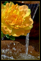
Color of Sun Burstby BrianRComment by slaakso: The colors of the flower are wonderful. I am distracted by the water splashing on the lower left, at least I think it's water. Might have worked better with a tighter cropping. |
| Photographer found comment helpful. |
| 09/25/2007 02:36:01 AM |
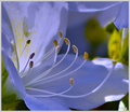
Act 1 The Openingby BrianRComment by Melethia: How beautifully delicate! Colors are so soft and gentle - very much compliments the nature of the flower itself. Nicely photographed! |
| Photographer found comment helpful. |
| 09/24/2007 08:53:11 PM |
Color of Sun Burstby BrianRComment by Rosacalaca: Nice, bright colors. I like the blur of the water in the background which doesn't take away from the focus of the primary object - a beautiful yellow, orange flower. |
| Photographer found comment helpful. |
| 09/24/2007 05:52:28 PM |
|
| Photographer found comment helpful. |
| 09/24/2007 05:04:16 PM |
Act 1 The Openingby BrianRComment by noraneko: I love the color in this azalea. You did a great job with giving it a natural appearance despite the fact that I don't even think azaleas come in blue (?) Nice movement in the stamens as well. |
| Photographer found comment helpful. |
| 09/24/2007 09:55:33 AM |
|
| 09/24/2007 12:59:50 AM |
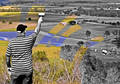
The Painter – ibkc – Selective Desaturationby BrianRComment by ibkc: I'm flattered you chose my shot, and impressed with the result. CNovack gave you a great critque of it. I think you should be proud of the shot, and it looks like you have some awesome work in your portfolio. |
| Photographer found comment helpful. |
| 09/23/2007 08:57:10 PM |
|
| Photographer found comment helpful. |
| 09/23/2007 07:55:19 PM |
The Painter – ibkc – Selective Desaturationby BrianRComment by CNovack: A good emulation off of the original. The difference is that this is a landscape scene that the painter paints rather than the seascape with boats scene. I like how you went with a paintbrush rather than a roller seen in the original. For me the paintbrush makes a stronger connection to the painter's of canvas paintings rather than a painter who does interiors or exteriors of walls. The landscape is a nice variation from the seaside scene we see in the original. However I think that the choice of scenery could have been more appealing visually. The foreground has scrub-brush bushes that in many areas have lost their foliage and are bare 'sticks'. Bushes with full greenery or various shades of greenery would add more visual appeal not to mention possibly add more color shades to the scene being painted. The colors of yellows on the rolling hillsides can be said to be 'fields of gold' but the color tones upon the water are an overly saturated blue almost purplish hue. Of course, the model and the photographer being the painter/creator of the picture I can almost hear you say "I'm the 'painter' of this composition and I can darn tootin' well choose the color tones I want to paint the scene:-)" That may be so, but for a greater audience appeal the colors should be not so oversaturated. I feel that they need to look more natural and richer in color tone variation for more visual appeal. |
| Photographer found comment helpful. |
Home -
Challenges -
Community -
League -
Photos -
Cameras -
Lenses -
Learn -
Help -
Terms of Use -
Privacy -
Top ^
DPChallenge, and website content and design, Copyright © 2001-2026 Challenging Technologies, LLC.
All digital photo copyrights belong to the photographers and may not be used without permission.
Current Server Time: 05/20/2026 06:36:52 PM EDT.